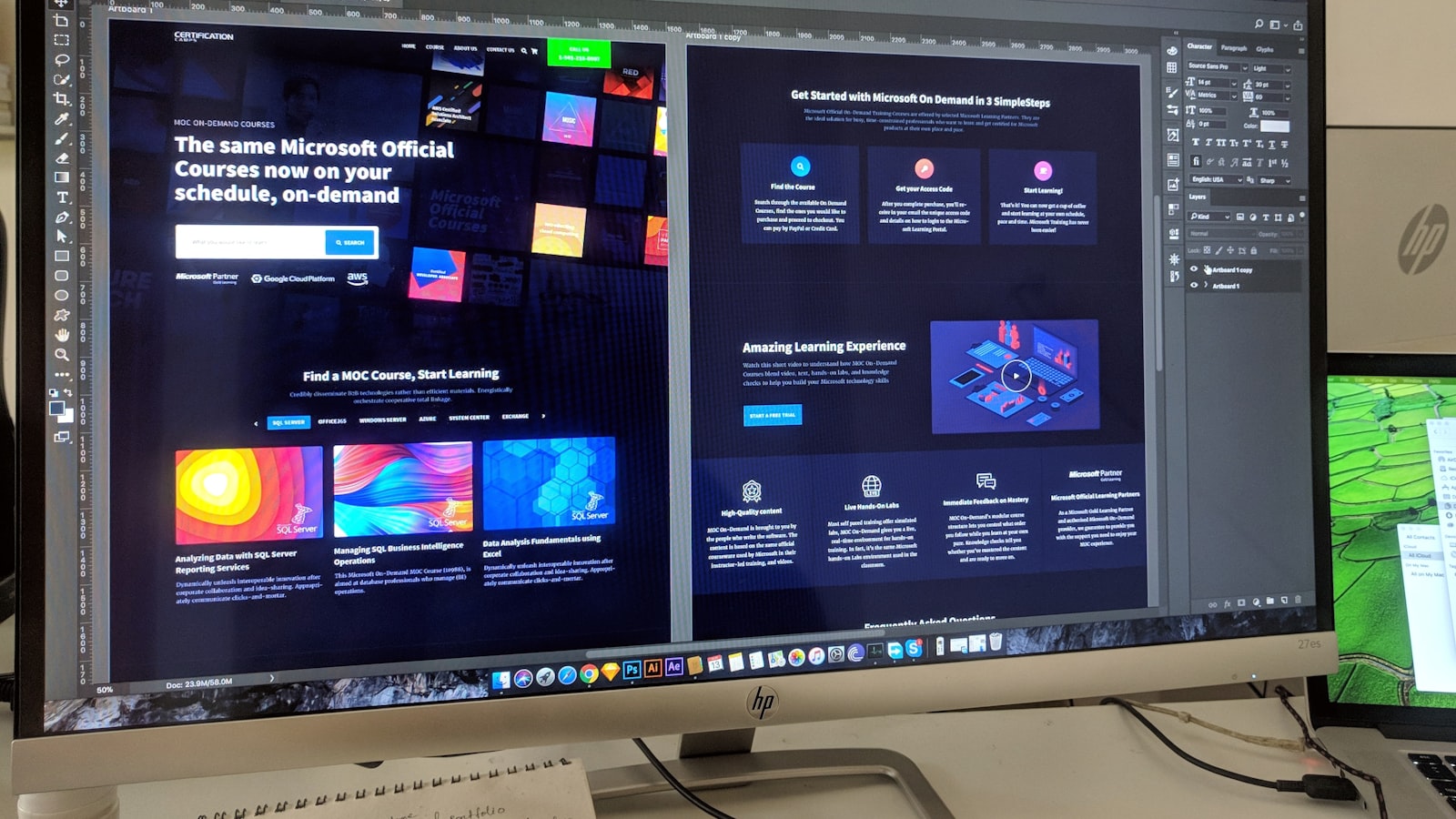
A design system is the single source of truth that lets a brand build consistent products and interfaces at scale — reusable components, defined tokens, documented patterns, and the rules for using them all. It’s the difference between a brand that holds together across five product screens, three teams and two apps, and one that drifts a little further out of sync with every release. This guide explains what a design system actually is, how it differs from brand guidelines and a style guide, and — just as importantly — when a Singapore business genuinely needs one versus when it’s overkill.
Design system vs brand guidelines vs style guide
These three get used interchangeably, but they’re different things at different altitudes.
- Brand guidelines are the strategic and visual foundation — logo usage, colours, typography, voice and the rules of the brand. They define what the brand is.
- A style guide is usually narrower and more specific — often editorial (how to write) or a basic visual reference. It defines how to apply a slice of the brand.
- A design system goes further than both. It turns the brand into reusable, functional building blocks — actual UI components, design tokens and interaction patterns — that teams assemble products from. It defines how the brand is built, in practice, at scale.
Put simply: brand guidelines tell you the colour is a specific blue; a design system gives you the button component, with that blue already baked in as a token, ready to drop into a screen, documented with when and how to use it. The system is downstream of, and depends on, a solid brand identity.
The building blocks: tokens, components, patterns
A mature design system is layered, and the layers build on each other:
- Design tokens — the smallest, named decisions: colour values, spacing units, type scales, border radii, shadows. Storing them as tokens means a change in one place (say, the brand blue) updates everywhere it’s used, automatically.
- Components — reusable interface elements built from tokens: buttons, form fields, cards, navigation, modals. Each is defined once, with its variants and states, and reused everywhere instead of rebuilt.
- Patterns — recurring solutions to common problems: how a form is laid out, how errors are shown, how a checkout flows. Patterns capture the how so teams don’t re-solve the same problem inconsistently.
Above all of it sits documentation — the usage guidance, do’s and don’ts, and rationale that lets someone who’s never met the original designer use the system correctly.
One source of truth: Figma and code in sync
A design system’s value comes from being the single source of truth that both designers and developers work from. In practice that usually means two synchronised libraries: a component library in a design tool like Figma, and a matching coded component library that engineers build with. When the two stay aligned, a designer and a developer are literally using the same button, and what’s designed is what ships.
When they drift apart — the Figma library says one thing, the codebase another — you get the exact inconsistency the system was meant to prevent. Keeping design and code in sync is the central discipline of running a design system, and it’s why a system is as much a way of working as it is a set of files.
Governance, versioning and accessibility
A design system is a living product, not a one-time deliverable, so it needs governance:
- Ownership — someone (or a small group) responsible for the system, who reviews changes and prevents one-off hacks from creeping in.
- Versioning — clear releases so teams know what changed and can update deliberately, rather than the system shifting under their feet.
- A contribution process — a defined way for teams to propose new components or changes, so the system grows with real needs instead of fragmenting into private variants.
Bake accessibility into the system rather than bolting it on. When colour-contrast, focus states, sensible touch targets and semantic structure are built into the components themselves, every product made from the system inherits accessible behaviour by default — which is far more reliable than expecting each team to remember it each time.
When an SME needs a design system — and when it doesn’t
Here’s the honest part: most small businesses don’t need a full design system, and building one too early is wasted effort. A design system earns its keep when you have scale and repetition — multiple products or apps, several people designing and building, frequent releases, and a real cost to inconsistency. For a single marketing website and a small team, well-organised brand guidelines plus a tidy component library in your website builder are usually enough.
Signs you’ve outgrown guidelines and genuinely need a design system:
- You have more than one digital product, or a product plus a marketing site, that must feel like one brand.
- Multiple designers and developers keep rebuilding the same elements slightly differently.
- Inconsistency is slowing teams down and creating visible quality problems.
- You’re scaling headcount and need new hires to ship on-brand work quickly.
For a growing Singapore tech company, SaaS product or multi-brand group, a design system pays back in speed and consistency. For a typical SME with one site, it’s premature — start with strong foundations and grow into a system when scale demands it. We help businesses pitch this at the right level rather than over-building; our portfolio shows that range.
The payoff: speed and consistency at scale
When it fits the need, a design system delivers two compounding benefits. Teams ship faster because they assemble products from ready, tested components instead of designing every screen from zero. And the brand stays consistent automatically, because consistency is built into the building blocks rather than policed document by document. That combination — faster output and tighter consistency — is why every product organisation of any size eventually invests in one.
Frequently asked questions
What’s the difference between a design system and a style guide?
A style guide documents rules and references — often editorial or basic visual guidance. A design system goes further, providing reusable, functional components, tokens and patterns that teams actually build products from, kept in sync between design and code.
Does a small business need a design system?
Usually not yet. A design system pays off with scale — multiple products, several people building, frequent releases. For a single website and small team, solid brand guidelines and a tidy component library are typically enough until you grow into a system.
What are design tokens?
Design tokens are named, reusable values — colours, spacing, type sizes, radii — stored centrally. Because everything references the token rather than a hard-coded value, changing it once updates every place it’s used, which keeps the whole system consistent.
How do you keep design and code versions of a system aligned?
Through governance: clear ownership, versioned releases, and a defined contribution process, with the Figma library and the coded component library treated as one synchronised source of truth so what’s designed is what ships.
Outgrowing your brand guidelines? Tell us about your products and team and we’ll help you build a design system that’s right-sized for where you are.