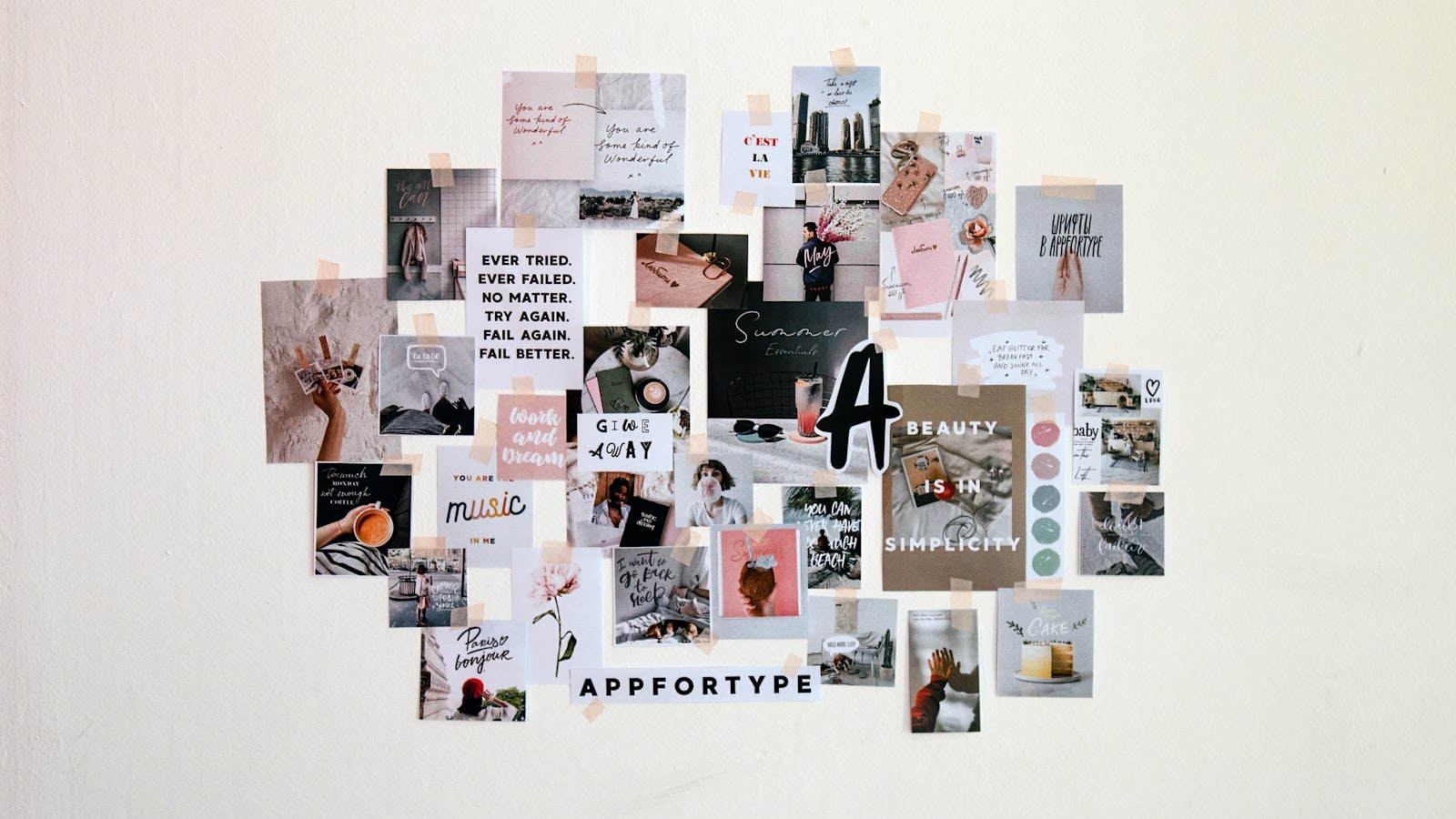
Before a single logo is drawn or a brand video is shot, there is usually a moodboard — a curated collection of images, colours, type and textures that captures the feeling you are after. It is the fastest way to get everyone aligned on direction before anyone spends real time or budget. This guide shows you how to make a moodboard for your brand, whether you are briefing a designer, planning a shoot, or just trying to pin down what you actually want.
A moodboard is not the finished design. It is a thinking and alignment tool — a way to point at a feeling and say “this,” so words like “modern” or “premium” stop meaning ten different things to ten different people.
Why a moodboard is worth the hour
“Make it clean and modern” means nothing on its own. One person pictures Scandinavian minimalism; another pictures glossy tech. A board replaces vague adjectives with concrete references, so the conversation happens before the work, not after a costly first draft has missed the mark.
It saves money and arguments. When we start a brand or shoot, the board is where misalignment surfaces cheaply — far better to discover a clash on a board than halfway through production.
Step one: get clear on the goal
Before collecting a single image, answer a few questions so the board has a purpose:
- What is this board for? A logo, a website, a photo shoot, a full rebrand? Each pulls different references.
- Who is the audience? A board for a youthful F&B brand looks nothing like one for a B2B consultancy.
- What feeling do you want? Pick three or four adjectives — “warm, trustworthy, local” or “bold, premium, minimal” — to act as a filter for what goes on and what stays off.
Those adjectives are your editing rule. If an image does not support them, it does not belong, no matter how nice it looks.
Step two: gather references widely
Now collect, broadly at first. Pull from many sources so you are not just copying one competitor:
- Pinterest and Instagram for visual inspiration across brands and industries.
- Brands you admire — including ones outside your sector, so the look feels fresh rather than derivative.
- Real-world textures and places — a Singapore shophouse facade, a material, a colour from a photo you took. Local texture grounds the brand here.
- Type and colour samples that catch your eye.
Collect more than you need. The strength of a board comes from editing down, and you can only edit a generous pile, not a thin one.
Step three: organise and curate
This is where a pile of images becomes a moodboard. Group what you gathered into rough categories and start cutting:
Common sections
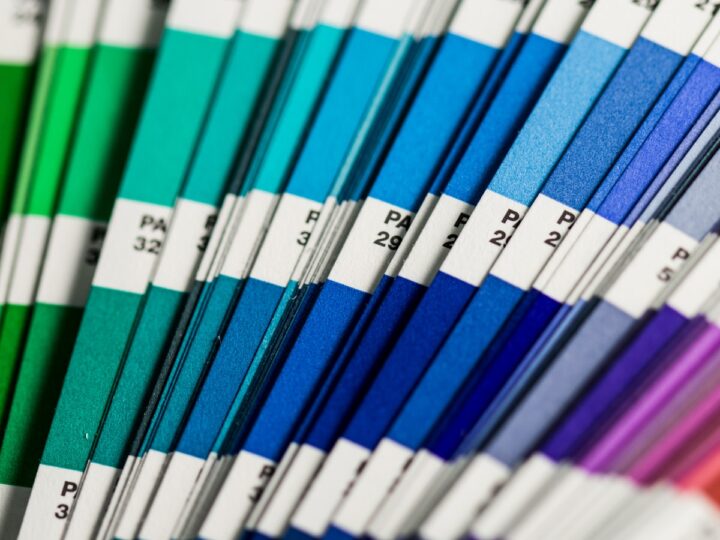
- Colour: a palette pulled from your images — the tones that keep recurring.
- Typography: the styles of lettering that fit the feeling.
- Imagery / photography: the kind of photos that match — lighting, framing, subjects, treatment.
- Texture and detail: materials, patterns and finishes that add character.
- Overall vibe: a few hero references that sum up the whole direction.
Be ruthless. Cut anything that fights the adjectives from step one. A focused board with a clear point of view is worth far more than a busy collage that hedges in every direction.
Step four: tools to build it
You do not need fancy software. Pick whatever lets you arrange images quickly:
- Canva — easy drag-and-drop, fine for most SME needs.
- Pinterest boards — great for collecting, though less controlled for presenting.
- Figma or Milanote — more flexible layout if you want a polished, shareable board.
- A simple slide — even a single well-arranged slide does the job.
The tool does not matter; the curation does. A tidy board in Canva beats a sprawling, unedited Pinterest dump every time.
Step five: pressure-test and refine
Once the board is together, step back and check it honestly:
- Does it feel like one direction, or two or three competing ones stitched together? If it is fighting itself, split it into options and choose.
- Does it match the goal and audience you set at the start?
- Would a stranger get the vibe from the board alone, without your explanation?
Share it with the people who will use it. A moodboard is a brief in pictures, so when we plan a brand video or a campaign, a strong board lets the whole team — designers, photographers, editors — pull in the same direction from day one. It also feeds straight into a photo shoot, setting the look before the camera comes out.
Frequently asked questions
What is a moodboard, exactly?
A moodboard is a curated collection of images, colours, type and textures that captures the feeling and direction you want for a brand, shoot or design. It is an alignment tool used before the real work begins, so everyone agrees on the look without relying on vague words.
How many images should a moodboard have?
There is no fixed number, but a focused moodboard usually lands somewhere modest — enough to communicate a clear direction without becoming a cluttered collage. Gather many, then edit hard so every image earns its place and supports the same feeling.
What’s the difference between a moodboard and brand guidelines?
A moodboard explores and captures a direction early on; it is loose and inspirational. Brand guidelines come later and lock down the exact rules — specific colours, fonts and logo usage. The board informs the guidelines, not the other way around.
Do I need design skills to make a moodboard?
No. With a tool like Canva and a clear sense of the feeling you want, anyone can assemble a useful board. The skill is in curating and editing, not in drawing — though a designer can help sharpen it into a stronger creative direction.
Got a moodboard and ready to bring it to life? Share your direction with us and we will turn it into real brand work.