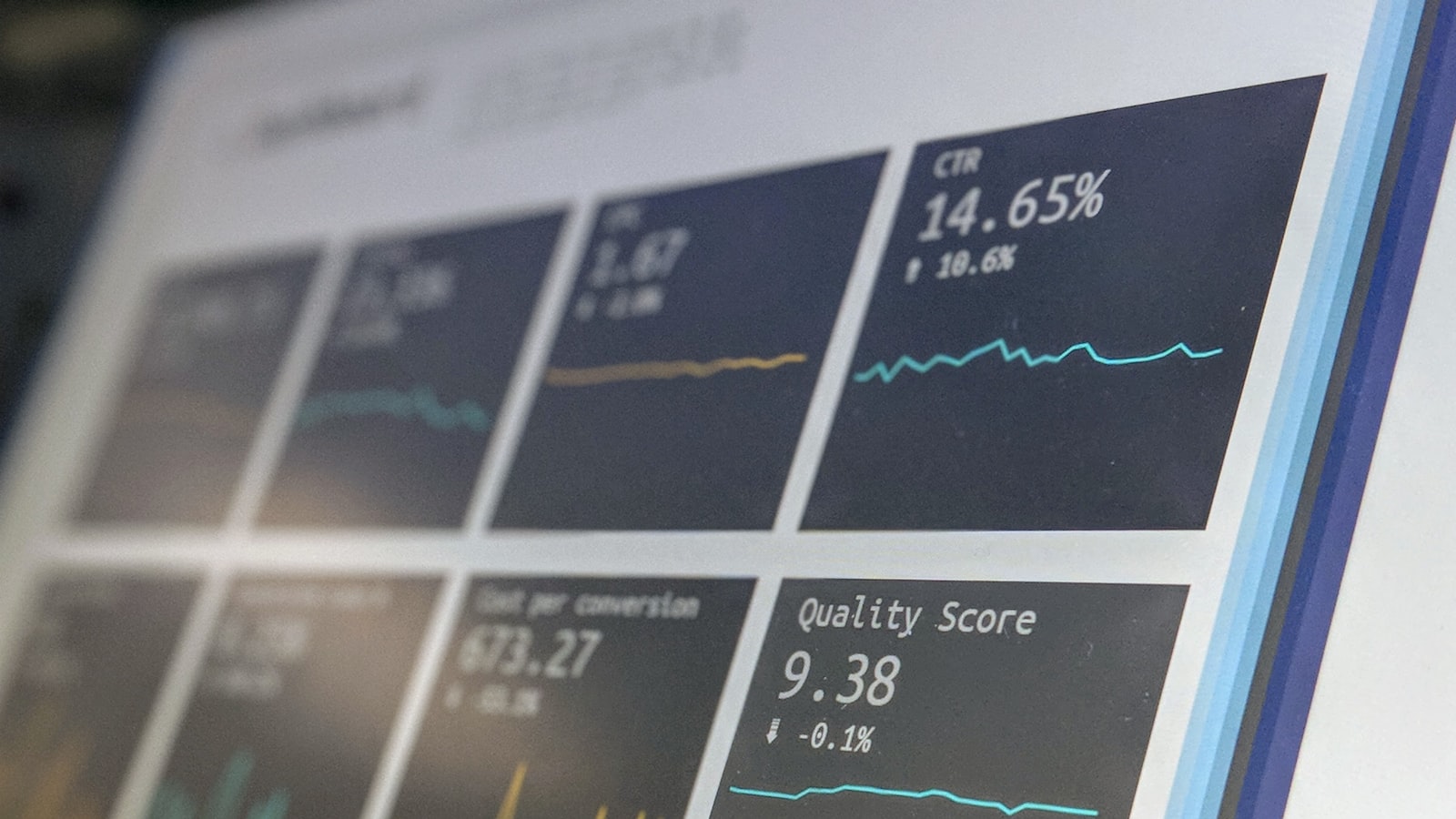
Infographic design is the craft of turning data and information into something people can understand at a glance. A page of statistics gets skimmed and forgotten; the same numbers shown well are grasped instantly and remembered. Whether it’s a single shareable infographic or a full data-heavy report, the goal is the same — make the meaning visible. The danger is decoration for its own sake: charts that look impressive but obscure the point, or “infographics” that are just text with icons. This guide covers how to design infographics and data reports that genuinely communicate.
If you publish research, results or any complex information, here’s how to make the data land.
Start with the message, not the chart
Good infographic design begins with a question: what’s the one thing this data should make the reader understand? The numbers are evidence; the message is the point. Designers who skip this end up visualising everything equally and communicating nothing.
- Find the headline insight in the data — the takeaway worth the reader’s attention.
- Decide the story the figures tell — a trend, a comparison, a surprising fact, a process.
- Then design to make that instantly clear, cutting anything that distracts from it.
This is editorial thinking applied to data, and it’s where the real value of branding and design shows up — not in prettier charts, but in clearer meaning.
Choose the right chart for the job
Each chart type is good at showing a particular kind of relationship, and using the wrong one buries the point. A quick guide:
- Bar charts — comparing quantities across categories. Reliable and easy to read.
- Line charts — change over time and trends.
- Pie / donut charts — parts of a whole, but only with a few segments; too many slices become unreadable, so use sparingly.
- Maps — geographic patterns.
- Single big numbers — one striking statistic deserves to stand alone, large and bold, not buried in a chart.
The principle: pick the simplest visual that makes the relationship obvious. Fancy chart types often impress less and confuse more.
Infographic design for clarity, not decoration
The most common failing in data design is ornament that gets in the way. Strip it back so the data does the talking:
- Reduce clutter. Remove gridlines, heavy borders, 3D effects and unnecessary labels — anything that isn’t helping the reader understand.
- Use colour with purpose. Colour should encode meaning or highlight the key point, not just brighten the page. One accent colour drawing the eye to the important figure beats a rainbow.
- Label clearly and directly. Put labels near or on the data where possible, so the reader isn’t hunting through a legend.
- Guide the eye. Use size, weight and position to establish what to look at first, second, third.
- Stay honest. Don’t truncate axes or distort scales to exaggerate — misleading visuals destroy trust, and an attentive reader will catch it.
Building a data narrative across a report
A full data report is more than a stack of charts — it’s a story told in sequence. Structure it so the reader is led through, not left to assemble the meaning themselves:
- Lead with the key findings — an executive summary or headline-stats section that gives the big picture before the detail.
- Order the sections logically so each builds on the last, like chapters.
- Pair every chart with a takeaway — a heading or short line that states what the data shows, so no reader is left guessing what a graph “means.”
- Vary the pace — alternate detailed charts with breathing space, pull-quotes and big single numbers so a long report stays readable.
- Apply a consistent design system — shared chart styles, colours, typography and layout grid, so the whole report feels like one considered document.
This is exactly the discipline behind well-designed annual, impact and research reports, and you can see that systematic approach across our portfolio.
Design for where it’ll be seen
How you design depends on the format and the reader:
- Shareable social infographics — bold, simple, one clear message, readable small on a phone; built to be scrolled past or stopped on in a feed.
- Print and PDF reports — can carry more depth and detail, designed for sustained reading.
- Interactive / web — let the reader explore, but still guide them to the headline insight first.
A dense report infographic dropped straight onto social won’t work, and a single punchy social graphic won’t carry a full report — design for the actual context.
Frequently asked questions
What makes a good infographic?
One clear message, the right chart for the relationship being shown, and a clean design that removes everything not helping the reader understand. The best infographics start from the headline insight in the data, use colour and size to guide the eye to what matters, and stay honest with scales. If a viewer can grasp the main point at a glance, it’s working; if it just looks busy and impressive, it isn’t.
How do I choose the right chart type?
Match the chart to the relationship in the data: bar charts for comparing categories, line charts for change over time, pie or donut charts for a few parts of a whole, maps for geography, and a single big number for one striking statistic. The rule is to pick the simplest visual that makes the relationship obvious — elaborate chart types usually confuse more than they impress.
What’s the difference between an infographic and a data report?
An infographic is typically a single, focused visual built around one message, often designed to be shared. A data report is a longer document that tells a fuller story across many sections and charts, structured like chapters with a consistent design system. Both rely on the same principle — lead with the insight and design for understanding — but they differ in depth and how the reader engages with them.
Sitting on data that deserves to be understood? We turn numbers into clear visual stories, from single infographics to full reports. Talk to us about your project.