
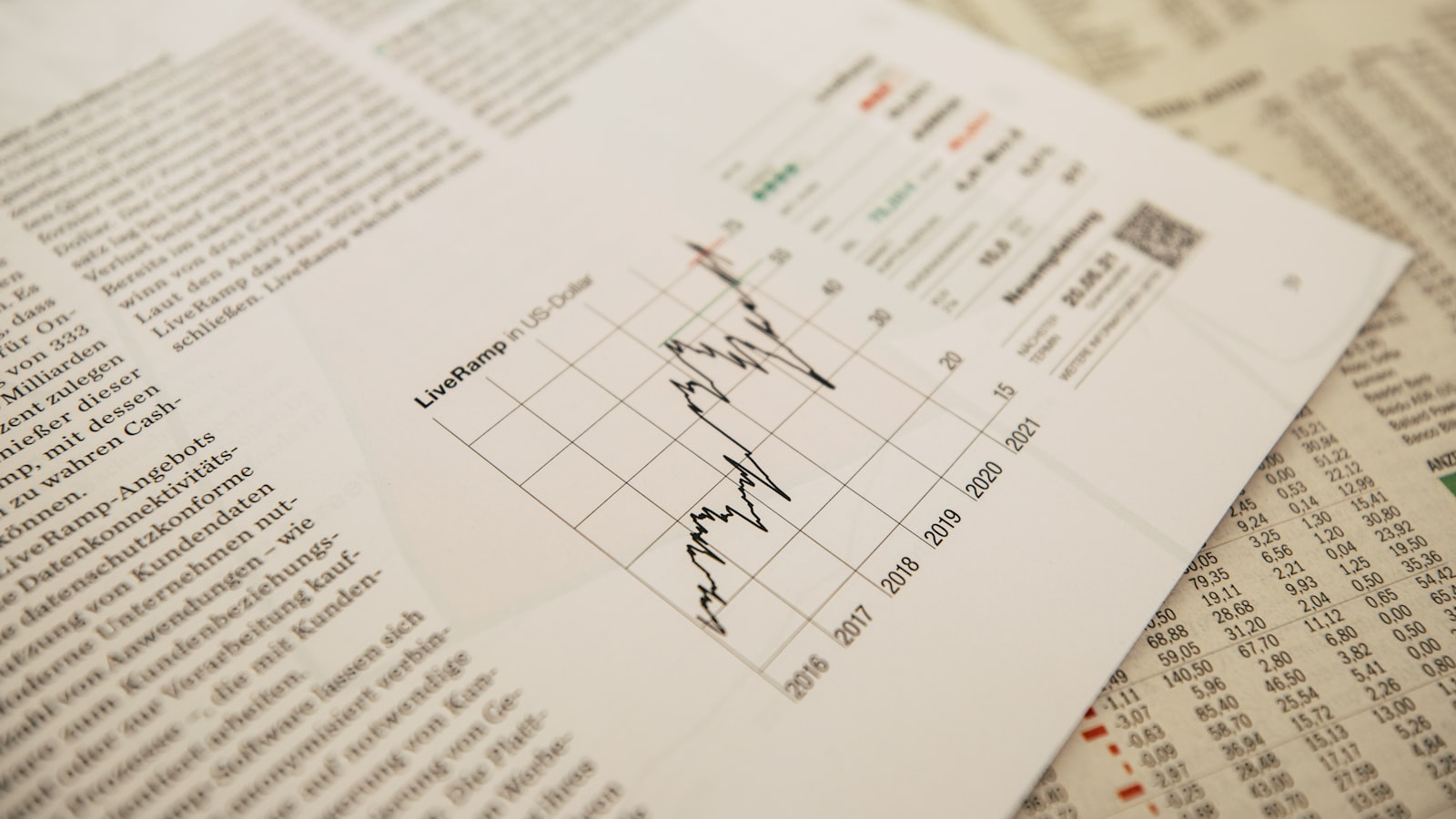
A corporate report is where an organisation makes its case in numbers and narrative — to investors, boards, members, regulators and the public. Strong report design turns dense data and long-form text into a document people can actually read and trust: clear structure, legible data, and a layout that signals competence before anyone reads a figure. This guide covers how we approach corporate report design as a Singapore studio — structuring the content, visualising data honestly, and preparing files for both print and digital reading.
What good report design actually does
A report has a harder job than most collateral: it must be thorough and accurate, yet still readable by people who will not read every page. Good design serves three readers at once — the skimmer who wants the headlines, the decision-maker who reads the summary and the charts, and the analyst who reads everything. The layout has to let each of them find their level without getting lost. It also carries a credibility signal: a clear, well-structured report reads as a well-run organisation, while a cramped, inconsistent one undermines confidence regardless of the content.
Structuring the content
Reports follow a recognisable spine, and a clear structure is what makes a long document navigable:
- Cover and contents — a clear, professional cover and a navigable contents page.
- Executive summary / highlights — the report in brief, often the most-read pages.
- Narrative sections — leadership messages, strategy, operations, organised with consistent section openers.
- Data and financials — tables, charts and statements, designed for accuracy and legibility.
- Appendices and governance — the detailed back matter.
Consistent section dividers, running heads and a clear hierarchy let readers move between these without losing their place across a hundred-plus pages.
Visualising data clearly and honestly
Charts and tables are where a report either clarifies or confuses. Our principles:
- Choose the right chart — a line for trends over time, bars for comparison, not a 3D pie that distorts proportion.
- Design for honesty — consistent axes and scales, no truncated baselines that exaggerate a change; the chart should tell the true story at a glance.
- A consistent visual language — one colour palette and chart style throughout, so a reader learns the system once.
- Legible tables — clear column alignment, generous spacing and subtle rules so dense figures stay readable.
The goal is data that communicates instantly and accurately. Decorative or distorted charts erode the very trust a report exists to build.
Grid, typography and pace
A flexible grid keeps a long report coherent. We typically run a multi-column grid that handles narrative text, full-width charts, sidebars and pull-out statistics without anything feeling improvised. Typographically, a clear hierarchy — from section header to subhead to body to caption — lets the document be skimmed or read in full. Pace matters too: full-bleed section openers, white space around key figures, and the occasional infographic spread give the eye somewhere to rest in a document that is mostly dense.
Print and digital: designing for both
Most corporate reports now live in two places — a printed copy for boards, AGMs and key stakeholders, and a PDF (and sometimes a web version) for wider distribution. We design with both in mind:
- Print — A4 is standard; 3mm bleed, CMYK, 300dpi images, content clear of the gutter on bound copies, and a binding suited to the page count (perfect binding for substantial reports).
- Digital PDF — RGB-aware colour, bookmarks and a clickable contents for navigation, accessible tagging where required, and file weight kept sensible for download and email.
Designing the two versions from one well-built source file keeps them consistent and avoids the mismatch of a print report awkwardly forced into a screen format. This editorial and data-design discipline is part of our branding and design service; you can see report and publication work in our portfolio.
Frequently asked questions
How long does report design take?
It depends on length and how settled the content is. The biggest variable is content readiness — reports involve many contributors and several rounds of figures, and design moves fastest once the data and copy are final. Building in time for proofing and fact-checking the numbers is essential, since errors in a published report are costly.
Should a report be print or digital?
Usually both. A printed copy still matters for boards, AGMs and key stakeholders, while a PDF and sometimes a web version reach a wider audience. Design from one source so the two stay consistent rather than drifting apart.
How do we keep charts honest?
Use the right chart type, keep axes and scales consistent, avoid truncated baselines and 3D effects that distort proportion, and label clearly. The chart should convey the true magnitude of a change at a glance — design that exaggerates or flatters the data undermines the report’s credibility.
Producing an annual or corporate report? Tell us about your report and we will structure, design and prepare it for both print and digital.


