
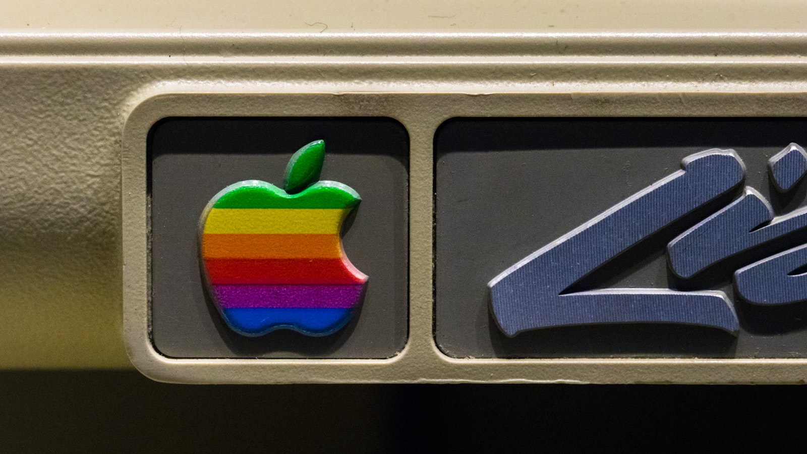
A logo redesign is one of those decisions that’s easy to get wrong in both directions — changing too soon and throwing away recognition you’ve spent years building, or clinging to a dated mark long after it’s started working against you. This guide lays out the honest signals it’s actually time, the difference between a tidy-up and a full rebuild, and how to redesign without your customers feeling like they’ve walked into the wrong shop.
Signals it’s genuinely time for a logo redesign
Not every itch to change is a real need. But these are the signs that usually mean a redesign is justified rather than vanity:
- It looks dated. Heavy bevels, drop shadows, gradients, or a typeface that screams a specific decade. Trends move; if your logo is stuck in 2009, customers notice even if they can’t articulate why.
- It’s illegible at small sizes. If your mark turns to mud as a favicon, app icon or social avatar, it’s failing at the sizes that matter most today.
- It doesn’t scale digitally. Fine detail, thin lines, or a horizontal lockup that can’t adapt to square and circular formats.
- A merger, pivot or repositioning. The business has changed what it does or who it serves, and the logo now tells the wrong story.
- Inconsistent versions everywhere. Different colours, stretched copies, three slightly different files floating around the office. Drift is a symptom worth fixing properly.
- Technical debt. You only have a low-resolution JPG or a PNG someone made years ago, with no vector master. You’re effectively held hostage by your own logo.
If you’re nodding at three or more of these, a redesign is probably overdue.
Refresh or rebuild? Know which one you need
These are very different jobs with very different risks, and confusing them wastes money.
A refresh (tidy-up)
A refresh keeps the core idea and recognisable elements but modernises the execution: redrawing for cleaner curves, updating the typeface, simplifying detail, adjusting colour for screen, and building proper digital-ready files. The brand stays clearly itself — most customers register “sharper” rather than “different”. This is the right call when the underlying idea is sound and only the execution has aged.
A full redesign (rebuild)
A full redesign rethinks the mark from the ground up. You do this when the business has fundamentally changed, when the old logo carries baggage you genuinely want to shed, or when there’s no salvageable equity. It’s higher risk and higher cost, and it usually pulls the rest of the brand identity along with it.
Most SMEs need a refresh more often than they need a rebuild. Reaching for a rebuild when a refresh would do is how brands accidentally erase years of recognition.
How to redesign without losing recognition
The biggest fear — losing the recognition you’ve earned — is manageable if you’re disciplined about it.
Start with an equity audit
Before changing anything, identify what’s actually worth keeping. What do customers recognise you by? It might be a colour, a shape, a symbol, or even a specific quirk. Those are equity assets. The audit separates “dated and disposable” from “dated but precious”, so you protect the right things.
Evolve, don’t erase
The safest redesigns keep at least one strong anchor — usually colour or core shape — while modernising everything around it. Think of the long line of well-known brands that have updated quietly over the years: each version is recognisably the last one, just sharper. Continuity is a feature, not a constraint.
Plan the rollout
Don’t sneak a new logo out and hope nobody notices, and don’t dump it everywhere overnight without a plan. A sensible rollout:
- Update the highest-visibility touchpoints first — website, app, social profiles, email signatures.
- Replace physical items as they cycle — signage, packaging, uniforms, vehicles — rather than scrapping perfectly good stock.
- Tell the story. A short “we’ve refreshed our look” note turns a potential “did they get bought out?” moment into a sign of momentum.
The Singapore SME angle
For a Singapore SME, the redesign decision is usually practical rather than precious. The most common trigger we see isn’t fashion — it’s technical. The business has outgrown a logo a relative or a cheap marketplace seller made years ago, there’s no usable vector file, and it’s now blocking everything from a new website to proper signage at a new unit. That’s a textbook redesign-or-refresh case.
The good news is you often don’t need to start over. A refresh that redraws the existing mark cleanly, rebuilds the file set, and adds simple guidelines fixes the real problem — inconsistency and technical debt — without spooking the customers who already know you. You can see how we’ve handled exactly this kind of evolution in our work portfolio.
Frequently asked questions
Will a logo redesign hurt my brand recognition?
Only if you erase rather than evolve. An equity audit before you start identifies what customers recognise you by, so you keep the load-bearing elements and modernise the rest. Done well, recognition is preserved or even strengthened.
How often should a logo be redesigned?
There’s no fixed schedule. Many strong logos go a decade or more with only light refreshes. Redesign in response to a real signal — dated look, technical limits, or a genuine business change — not because you’re simply bored of it.
How much does a logo redesign cost compared to a new logo?
A refresh of an existing mark is often less than a fresh design because the core idea already exists. A full rebuild costs about the same as starting from scratch, since that’s effectively what it is. The equity audit is the cheap step that tells you which one you actually need.
Ready to start? Tell us about your project and we’ll do an honest assessment of whether your logo needs a refresh, a rebuild, or simply better files.


