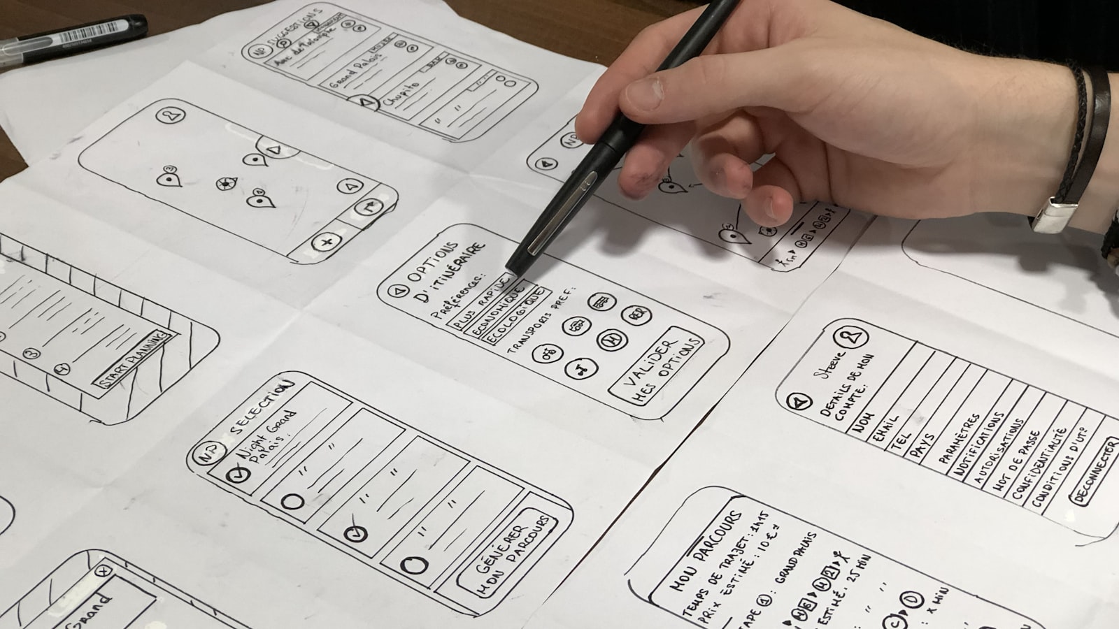
Most layouts that feel “off” are not a font or colour problem — they are a structure problem. Grid systems are the invisible scaffolding that holds a layout together: a set of intersecting lines that decide where text, images and white space sit. Get the grid right and everything you place on it looks deliberate, aligned and on-brand, whether it’s a brochure, a poster or a website.
This guide covers the grids we actually use, the parts that make them up, and a step-by-step way to build one for your own work.
Why use a grid at all?
A grid does three jobs. It creates consistency, so a 20-page report doesn’t drift page to page. It speeds up decisions, because you’re choosing from a finite set of positions instead of nudging things by eye. And it makes collaboration possible — two designers working to the same grid produce work that sits together.
For brand work this matters more than people expect. A grid is what lets a name card, a pitch deck and a shopfront poster feel like one family even when different people made them months apart.
The main types of grid systems
There is no single “correct” grid. You pick the type that suits the content.
- Manuscript grid — a single text block inside margins. The oldest grid, ideal for long-form reading: books, essays, long reports.
- Column grid — the page split into vertical columns separated by gutters. The workhorse for magazines, newsletters and most marketing collateral.
- Modular grid — a column grid crossed with horizontal rows, creating a matrix of modules. Best for dense, varied content: catalogues, price lists, data-heavy reports, calendars.
- Baseline grid — a horizontal rhythm that all text sits on, like ruled lines in a notebook. It runs underneath the other grids to lock vertical alignment.
- Hierarchical grid — a loose, content-led grid where the structure is improvised to fit the material, often used for posters and web heroes where a strict matrix would be too rigid.
The anatomy: margins, columns and gutters
Every grid is built from the same handful of measurements. Decide each one consciously.
- Margins — the breathing space around the live area. Generous margins read as premium; tight margins feel busy. For print, never run important content into the margin, and remember the binding edge needs extra room on bound documents.
- Columns — the vertical zones content snaps to. More columns give more flexibility (you can span content across several), fewer columns give simpler, calmer layouts.
- Gutters — the gaps between columns. Too narrow and two text columns blur together; a gutter of roughly your body line-height is a safe starting point.
- Flowlines and rows — horizontal divisions that give you consistent points to start headings or images.
A practical print starting point: an A4 page with a 12-15mm margin, three to four columns, and gutters around 4-5mm. From there you adjust to the content, not the other way round.
The baseline grid and vertical rhythm
The baseline grid is the part most people skip, and it’s the part that separates tidy work from professional work. You set a baseline increment — often your body text’s leading, say 12pt — and every line of text snaps to a multiple of it. Headings, captions and spacing are all sized in multiples of that increment.
The payoff is vertical rhythm: text in adjacent columns lines up across the page, and the bottoms of columns align. To make it work, set your heading and caption leading as whole multiples of the baseline (e.g. a 24pt heading on a 12pt baseline), and let space-before and space-after also land on the grid. In InDesign you can switch on “Align to baseline grid” and snap paragraphs to it.
Breaking the grid on purpose
A grid is a tool, not a cage. The rule we work to: build the grid first, master it, then break it deliberately. A full-bleed image that ignores the columns, an oversized number that crosses the gutter, a quote pulled out of alignment — these create emphasis precisely because everything around them obeys the structure.
The danger is breaking the grid by accident or out of laziness. A deliberate break looks confident; a careless one just looks misaligned. If you can’t say why something sits off-grid, it should go back on.
Responsive grids for digital
On screen the standard is the 12-column grid, because 12 divides cleanly into halves, thirds, quarters and sixths — so the same grid handles 2-up, 3-up and 4-up layouts without fighting you. Web grids add a few extra ideas:
- Fluid columns that stretch with the viewport, with gutters often set in fixed pixels or rem.
- Breakpoints where the column count drops — 12 on desktop might collapse to 6 on tablet and a single stack on mobile.
- A max content width so line length stays readable on large monitors instead of running to 200 characters.
CSS Grid and Flexbox make these straightforward to implement, but the thinking is the same as print: define columns, gutters and margins, then place content into them.
Print grids and brand consistency
For brand systems, the grid is a governance tool. When we set up a brand’s design system we define one grid logic that scales across formats — name cards, A4 letterhead, A5 flyers, roll-up banners — usually sharing a column count and a consistent margin ratio. That way anyone producing collateral, in-house or external, has rails to work on and the output stays coherent. You can see how this discipline plays out across our portfolio of brand work, and it’s a core part of how we approach branding and design.
How to set up a grid, step by step
- Start with the content. Audit what has to fit — text length, image count, data tables. The content dictates the grid, not a template.
- Set your margins to define the live area and the mood (tight vs spacious).
- Choose a column count that gives the flexibility you need without becoming fussy.
- Set the gutter wide enough to separate columns cleanly.
- Establish the baseline grid from your body leading and size everything in multiples of it.
- Test it on real content across several pages or screens, then refine.
Frequently asked questions
How many columns should my grid have?
It depends on the content, but common defaults work well: 12 columns for digital, and three to six for print depending on density. More columns mean more flexibility to span and combine; fewer mean simpler, calmer layouts. Start with the layouts you need to build and pick a count that divides into them cleanly.
Do I really need a baseline grid?
For long or text-heavy documents, yes — it’s what makes type line up across columns and pages. For a single poster with one block of text, it matters far less. The more pages and the more text, the more a baseline grid earns its keep.
Can a strong grid make a design boring?
A grid only provides the structure; it doesn’t make the creative decisions. Boring layouts come from never deviating, not from having a grid. Use the grid for order, then break it intentionally for emphasis — that contrast is where good layout lives.
Want layouts that hold together across every piece of your brand? That structural discipline is exactly what we build into our design work. Get in touch and we’ll help you put a grid system behind your brand.