
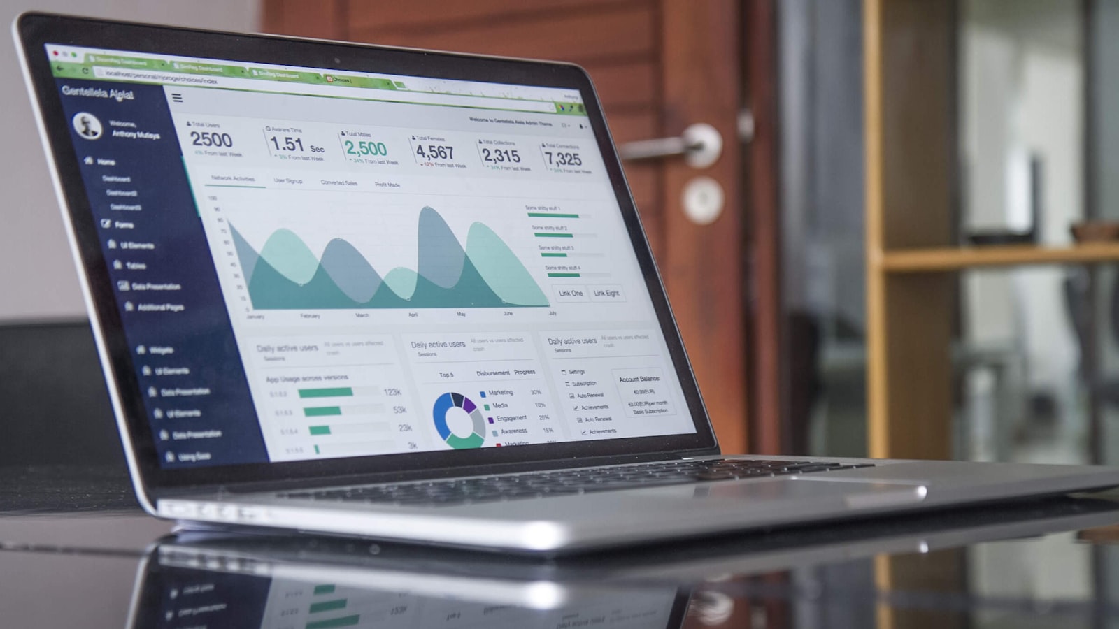
Every software category now looks the same: a gradient logo, a hero line about “empowering teams to do their best work”, a screenshot of a dashboard, three pricing tiers. When the products are this comparable and the websites this interchangeable, the brand is often the only thing a buyer can actually tell apart. SaaS branding is the discipline of standing out in that sea of sameness — making an intangible product feel real, trustworthy and worth choosing. This guide is for Singapore tech founders and product teams trying to look like more than a template.
Why SaaS branding is uniquely hard
Software has no physical form. There’s no packaging to hold, no shelf presence, no product to touch — just a promise of what happens after someone signs up. That makes branding harder and more important than in almost any other category, because the brand has to do the work the product can’t yet do: convey what it feels like to use, who it’s for, and why it’s credible.
On top of that, the category is brutally crowded and fast-moving. Features get copied within months, so “we have X feature” is a fragile position. What’s much harder to copy is a distinctive brand — a clear point of view, a recognisable personality, a name and look people remember. In SaaS, the brand is one of the few durable moats a feature can’t erase.
Making the intangible tangible
The central craft of SaaS branding is turning abstract software into something a buyer can grasp and feel in seconds. The techniques that do this:
- Show the product doing its job. Clean, well-art-directed UI shots, short product videos and interactive demos make the value concrete far faster than adjectives. Design the product visuals as carefully as the logo — they are the brand.
- Use illustration and motion to explain. Good SaaS brands lean on custom illustration and subtle animation to visualise abstract concepts (data flowing, tasks completing, teams connecting) that are otherwise invisible.
- Lead with the outcome, not the feature. Buyers don’t want “automated workflows” — they want to go home on time. Branding that names the outcome lands harder than one that lists capabilities.
- Make complexity feel simple. If your brand makes a technical product feel approachable and clear, you’ve already beaten most competitors who hide behind jargon.
Trust: the quiet dealbreaker in SaaS
Buyers are handing software their data, their workflows and sometimes their whole business operations. Before they commit, they’re unconsciously asking: are these people legitimate, will they still exist next year, is my data safe with them. A SaaS brand has to answer yes before a trial even starts. That means:
- Looking established and credible, even when you’re early. A polished, coherent brand signals a serious company; a scrappy, inconsistent one signals risk to a cautious buyer.
- Signalling security and reliability — clearly, without drowning the message in compliance jargon.
- Social proof done well: recognisable logos, real use cases and credible voices reassure buyers they’re not the only ones taking the bet.
- Consistency across every surface — website, product, emails, docs and support. Inconsistency reads as a company that isn’t fully in control, which is the last thing you want a buyer thinking before they trust you with their data.
Standing out without resorting to gimmicks
Differentiation in SaaS doesn’t come from a louder gradient or a quirkier mascot for its own sake. It comes from a clear, defensible answer to “who is this really for, and what do we believe”. The strongest tech brands have an actual point of view — about how work should be done, what the incumbents get wrong, who they’re built for. That conviction then drives a distinctive voice and look, rather than the look being decoration over a generic positioning.
Practical ways to break from the template: pick a verbal tone that sounds like a real human with opinions, not a committee; build an ownable visual system (a distinctive colour, an illustration style, a typographic character) instead of defaulting to the same blue-and-white SaaS aesthetic; and be specific about your audience rather than claiming to be “for everyone”. A tool that clearly knows exactly who it’s for is more compelling than one that tries to appeal to all.
Getting from a generic look to an ownable identity system is the core of a branding and design engagement, and you can see how distinctive identities come together across sectors in our work portfolio.
Branding for two audiences at once
Many SaaS products are bought by one person and used by another — a manager signs the contract, a team uses the tool daily; or a developer champions it internally while finance approves it. A SaaS brand often has to speak credibly to both the technical user and the business buyer without alienating either. The usual answer is layered communication: a clear, benefit-led top layer for decision-makers, with deeper technical substance one click down for the people who’ll actually evaluate and use it. The brand stays consistent in personality while flexing its depth depending on who’s reading.
Frequently asked questions
We’re an early-stage startup. Isn’t branding premature?
You don’t need a huge brand exercise pre-product-market-fit, but you do need to look credible and clear from day one, because trust is what gets people to trial an unknown tool. A focused identity — clear positioning, a clean look, a coherent website — is usually worth doing early. You can deepen it as you grow; you just shouldn’t look untrustworthy while you’re trying to win your first customers.
How do we stand out when competitors copy features within months?
By building advantages they can’t copy as easily: a distinctive brand, a clear point of view, a recognisable personality, and a reputation for how you make people feel. Features are temporary differentiators; a strong brand and the trust it earns compound over time. That’s exactly why SaaS branding is a strategic investment, not a cosmetic one.
Should our brand match the product’s UI?
They should feel like one system, yes. The product is one of your most-seen brand surfaces, so the colours, type and tone in the app should be a natural extension of the marketing brand — not a different world. When the website and the product feel like the same company, the whole experience reads as coherent and trustworthy.
Trying to stand out in a crowded category? We help tech and SaaS companies build distinctive, credible brands that don’t look like everyone else’s. Explore our branding and design work, then tell us about your project.


