
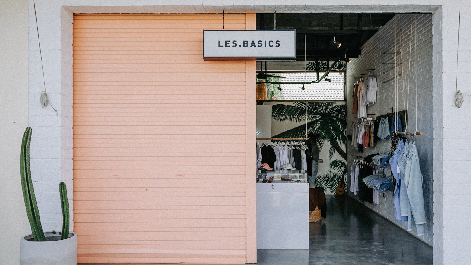
Your shop signage is the hardest-working piece of marketing you will ever buy. It runs every hour the street is busy, it is seen by far more people than any ad you could place, and for a first-time customer it is the entire basis on which they decide whether to walk in. A great storefront sign pulls people through the door; a poor one quietly turns them away. This guide explains how shop and storefront signage is designed for visibility, brand and the practical realities of operating in Singapore.
The job of a shopfront sign
Before any design, it helps to be clear about what a shop sign must do, in order of priority. First, it has to be seen and read from the distances and angles people actually approach from — down the street, across the mall atrium, from a passing bus. Second, it has to say what you are, instantly, especially for a category that is not obvious from the window. Third, it has to convey the right impression of your brand — premium, friendly, traditional, modern — in a glance.
Many shop signs fail the first test by prioritising style over legibility, or the second by being so abstract that nobody can tell what is sold inside. Good design solves all three together.
Visibility: legible at speed and distance
Storefront signage is read on the move, often peripherally. That demands strong contrast between text and background, a clear and well-spaced typeface, and lettering sized to the viewing distance rather than to the available space. The name and category should dominate; secondary information such as opening hours or a tagline belongs lower in the hierarchy or on a separate element.
Illumination matters in Singapore, where shops trade into the evening and many sit in covered malls and walkways. A sign that reads beautifully at noon can disappear at 8pm if it is not lit or backlit. Halo-lit letters, light boxes and well-placed external lighting keep a shopfront working after dark.
Turning your brand into a storefront
A shop sign is your brand made physical and public. The typeface, colour, materials and finish all signal what kind of business you are before a customer reads a word. A heritage kaya toast shop, a minimalist skincare boutique and a neighbourhood hardware store each need a completely different signage language, and that language should match the rest of the brand — the interior, the packaging, the website.
This is why shopfront signage and identity work belong together. When the sign, the shop and the brand all speak with one voice, the business feels considered and trustworthy. Building that coherence is the core of our branding and design work, where the storefront is treated as a flagship expression of the brand rather than an afterthought.
Materials and construction choices
How a shop sign is built shapes both its look and its lifespan:
- Built-up / channel letters — individual dimensional letters, often illuminated, for a premium, crafted feel.
- Light boxes — illuminated panels that read strongly day and night, common in food and retail.
- Flat panel signs — printed or vinyl-applied boards, economical and flexible.
- Acrylic and metal combinations — for a contemporary, layered look.
- Window graphics — vinyl lettering and decals that extend the brand across the glass.
For Singapore’s climate, exterior shop signage needs genuinely weather- and UV-resistant materials and finishes, while sheltered mall units have more freedom. The right construction balances the look you want against durability and budget.
Approvals: landlords and authorities
This is where many shop signage projects stumble. If you are in a mall, an HDB commercial unit or a managed development, the landlord almost always has signage guidelines governing size, position, illumination, projection and sometimes even materials and fonts — and they must approve your design before you install. External signage on a building may also require authority approval. Designing a sign that breaches these rules wastes time and money.
An experienced approach checks the constraints first and designs within them, so your beautiful concept is also installable. Flagging approval requirements early is part of doing the job properly, not a surprise at the end.
Common shop signage mistakes
The recurring errors are easy to avoid once you know them: making the name too small while crowding in secondary information; choosing a stylish but illegible font; forgetting evening visibility; using a sign that gives no hint of what is sold; and treating the sign as separate from the brand so it clashes with the shop’s own interior and packaging. Each is a missed opportunity, because the sign is seen by far more people than ever come inside. You can see how we approach physical brand expression across our portfolio.
Frequently asked questions
How big should my shop sign be?
Big enough to read comfortably from where customers approach — down the street, across the mall, from passing traffic — but within your landlord’s and any authority’s size limits. The name and category should dominate; size them to viewing distance rather than simply filling the available space.
Do I need approval for my shop sign in Singapore?
Usually, yes. Malls, HDB commercial units and managed developments have signage guidelines and an approval process governing size, position and illumination, and external building signage may need authority approval. It is best to check these constraints before finalising a design so it can actually be installed.
Should my shop sign match my branding?
Absolutely. The sign is your most visible brand asset and should share the same typeface, colours and feel as your interior, packaging and online presence. A consistent storefront makes the business feel considered and trustworthy, and reinforces recognition every time someone passes.
Opening or refreshing a shopfront? Tell us about your project and we will design signage that gets noticed and reflects your brand.


