
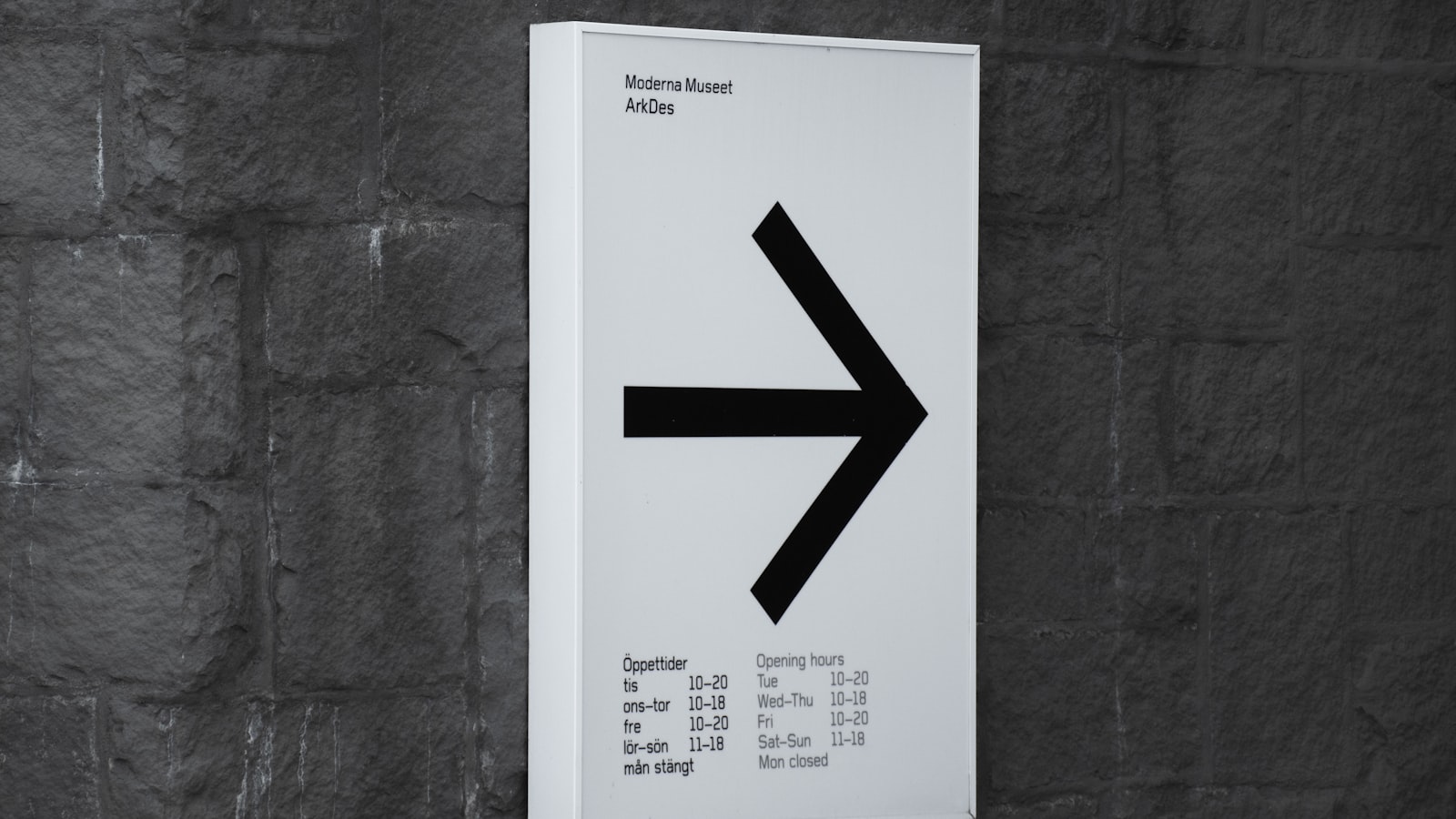
Wayfinding is the quiet system that lets people move through a building or precinct without stopping to ask for directions. When it works, nobody notices it; when it fails, everyone feels lost, frustrated and a little anxious. Good wayfinding design is far more than putting up signs — it is an information system mapped to how people actually move and make decisions. This guide covers how we approach wayfinding design as a Singapore studio: understanding the journey, building a sign hierarchy, designing for legibility, and choosing materials that suit the environment.
Wayfinding is a system, not a set of signs
The most common mistake is treating wayfinding as a shopping list of signs to install. In reality it is a system that has to mirror how a person experiences a space — where they enter, where they hesitate, where they choose a direction, and where they confirm they are on the right path. Signs are only the visible output. The real work is mapping the journey and deciding what information a person needs at each point, and crucially, what to leave out so the system stays clear. Too much signage is as disorienting as too little.
Mapping decision points
The foundation of any wayfinding system is the network of decision points — the places where a person must choose a direction. We walk the space as a first-time visitor would, identifying:
- Entries and arrival — where orientation begins; people need to know where they are and the main options.
- Junctions and lift/escalator lobbies — where directions split and confirmation is needed.
- Destinations — where arrival is confirmed.
- Reassurance points — along long stretches, to confirm the visitor is still on track.
A sign that does not sit at a decision point is usually clutter. Placing the right information at exactly the right moment is what makes a system feel effortless.
The sign hierarchy
Wayfinding works in layers, each doing a defined job:
- Identification signs — name a place (“Level 3”, “Meeting Room 2.1”, building names).
- Directional signs — point the way at decision points, with arrows and destinations.
- Orientation signs — maps and directories that show the whole picture (“you are here”).
- Regulatory and safety signs — rules, restrictions and emergency information.
Keeping these layers visually distinct yet part of one family lets a visitor instantly know what kind of information they are looking at. Consistency across the system — same type, colours, arrow style and placement logic — is what builds the trust that lets people follow signs without second-guessing.
Designing for legibility and inclusion
Wayfinding lives or dies on whether people can read it quickly, often from a distance and on the move. Legibility decisions are deliberate:
- Type size to viewing distance — letter height scaled so signs are readable from where people first see them.
- Clear, legible typefaces — open, unfussy letterforms; strong contrast between text and background.
- Consistent arrow and icon system — unambiguous arrows and recognised pictograms that cross language barriers, important in multilingual Singapore.
- Accessibility — tactile and Braille signage where required, mounting heights that work for wheelchair users, and contrast that helps low-vision visitors.
Designing inclusively is both good practice and, for many Singapore buildings, an accessibility requirement.
Materials, mounting and the built environment
Wayfinding is physical, so design has to meet the building. Material and mounting choices depend on the environment — interior versus exterior, weather exposure, durability needs and how the signs integrate with the architecture and lighting. The signage should feel like it belongs to the space and the organisation’s brand, not bolted on. We also plan for the practical realities: how signs are fixed, how they will be cleaned and maintained, and how easily individual panels can be updated when a tenant or room name changes, so the system stays accurate over years rather than going stale. Wayfinding sits at the meeting point of brand, environment and information design, which is how we approach it through our branding and design service. You can see design projects in our portfolio.
Frequently asked questions
How do you start a wayfinding project?
By understanding the space and its users, not by designing signs. We walk the building as a first-time visitor, map the journey and decision points, and define what information is needed where. Only once that information strategy is clear do we design the signs themselves — design-first projects that skip this step tend to produce clutter.
How many signs does a building need?
Fewer than people expect, placed precisely. The goal is the right information at each decision point, not a sign on every wall. Over-signing is a common cause of confusion; a clear, restrained system is easier to follow and cheaper to maintain.
Should wayfinding match our brand?
Yes — wayfinding is part of the experience of your organisation, and it should feel like it belongs to your brand through type, colour and tone. The balance is making it on-brand while keeping legibility and clarity first; the system must work for a lost visitor before it flatters the brand.
Planning a wayfinding system? Tell us about your space and we will map the journey and design a system that gets people where they are going.


