
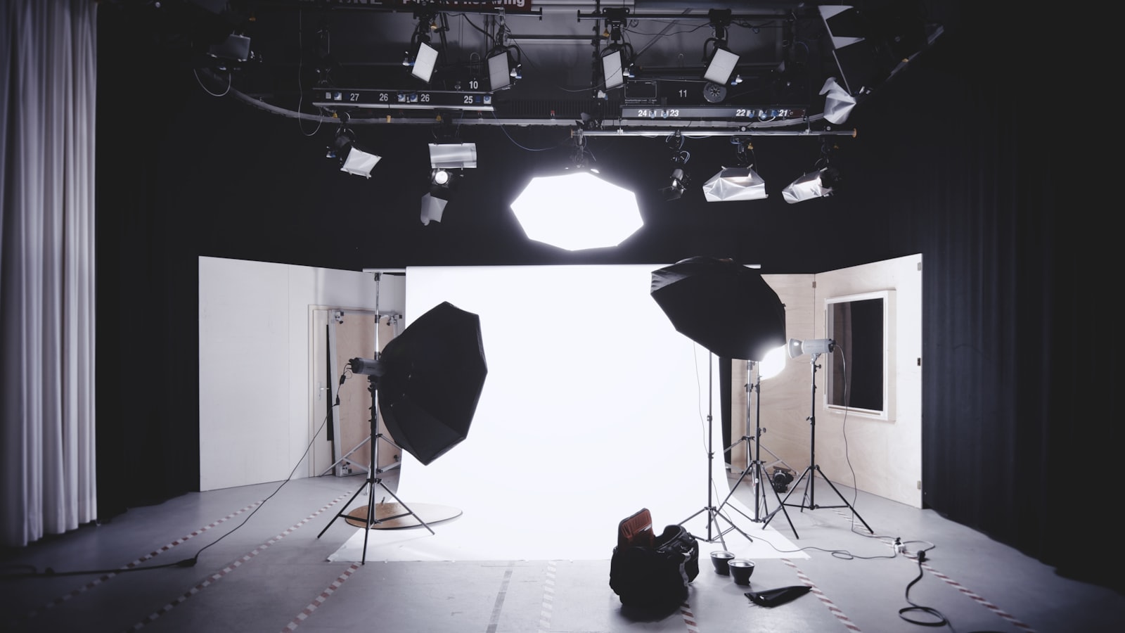
A brand photography style is the agreed set of decisions that makes every image you publish look like it came from the same brand — the subjects you show, how they’re lit, how they’re framed and how they’re graded. Without it, you end up with a feed that’s half warm candid lifestyle and half cold studio product, and the brand feels like two companies sharing a logo. This guide walks through how we define a photography style and, crucially, how we document it so every future shoot matches the first.
The point isn’t one beautiful campaign. It’s a repeatable look that survives a new photographer, a tight deadline and the inevitable day you have to fall back on stock.
Define the art direction first
Before booking anyone, decide what the photography is actually trying to say. Art direction is a stack of deliberate choices, and each one shifts the feeling:
- Subject — real customers and staff, or models? Hands and details, or full scenes? Product hero shots, or product in use?
- Composition — generous negative space and centred subjects, or tight, busy, energetic crops? Eye-level, or dramatic angles?
- Lighting — soft natural window light reads honest and warm; controlled studio light reads premium and precise. Pick a default and note when you’d break it.
- Depth of field — shallow, dreamy backgrounds feel premium and intimate; deep focus feels documentary and trustworthy.
- Candid vs styled — caught-in-the-moment authenticity, or composed and art-directed. Most brands land somewhere on a slider between the two, and naming where matters.
Write these as decisions, not adjectives. “Natural light, eye-level, shallow depth of field, real staff, warm grade” briefs a shoot. “Modern and clean” does not.
Build a reference board and a shotlist
Two documents do the heavy lifting on every shoot.
A reference board collects 15 to 30 images that nail the target look — lighting, mood, framing, colour. Annotate why each one is there (“note the soft shadow”, “this is too cold for us”) so it directs rather than just decorates. A board without notes gets interpreted ten different ways.
A shotlist turns the board into a plan: every specific image needed, with subject, orientation (you almost always need both landscape and portrait crops for web and social), and where it’ll be used. A shotlist is what stops you arriving back from an expensive shoot missing the one hero image the homepage actually needed.
Lighting, colour grading and depth
Consistency lives or dies in two places: lighting and grade. Decide your lighting recipe and keep it — if your look is soft natural light, don’t let one shoot come back hard-flashed. For colour, build or buy a LUT or preset that defines your grade: how warm the whites are, how lifted the shadows sit, how saturated the colours run. Apply the same grade across every image and even mediocre source photos start to feel like one family.
Singapore light is a real variable here. Bright overhead tropical sun creates harsh shadows around midday, so outdoor shoots often work best in the softer light of early morning or late afternoon, or in open shade. If your style is bright and airy, plan the schedule around the light rather than fighting it in post.
Casting, wardrobe and location that ring true
For a Singapore audience, authenticity is mostly a casting and styling problem. A few practical rules:
- Casting — reflect the real mix of people your customers see every day. A cast that looks nothing like the actual market reads as imported and erodes trust.
- Wardrobe — dress for the real context. Office wear that ignores the climate, or styling that’s too polished for the brand, both ring false.
- Location — recognisable, lived-in settings beat generic ones. An HDB void deck, a hawker centre, a real office in the CBD all anchor a brand locally far better than an anonymous white room.
These choices are where a brand either feels like it belongs here or feels like a template. We handle photography and content as part of the same branding and design work, precisely so the images match the rest of the identity rather than being shot in a vacuum.
Make stock match your commissioned shoots
You will use stock at some point — for a quick campaign, a blog header, a gap in the shotlist. The trick is making it look like yours. Select stock that already fits your lighting and composition rules, then run it through the same preset as your commissioned work. A consistent grade is the great equaliser: it pulls disparate sources toward one look. Keep a small approved-stock shortlist so the team isn’t choosing fresh, off-brand images under deadline pressure.
Document the direction so every shoot matches
A style only compounds if it’s written down. Capture it in a short photography guide that includes:
- The art-direction decisions, stated plainly.
- The reference board with annotations.
- Lighting setup notes and the preset or LUT file itself.
- Do and don’t examples — ideally real images that passed and ones that didn’t, with the reason.
- Crop and orientation requirements for each channel.
Hand this to any photographer and the odds of a matching result go up enormously. You can see how a defined photographic style threads through full brand projects in our work portfolio.
Frequently asked questions
Do we need a custom shoot, or is stock enough?
Stock is fine for filler and early stages, especially when graded to match your look. But your hero moments — the homepage, key campaigns, anything showing your actual product, space or people — almost always need commissioned photography. Real images of your real business carry a credibility stock can’t fake.
How do we keep two different photographers consistent?
Give both the same documented direction: the reference board, the lighting notes and, most importantly, the same colour preset for post. The grade is what visually unifies different shooters. Without a shared preset, even two skilled photographers will hand back work that looks like two different brands.
How often should we refresh our photography style?
A well-defined style should hold for a few years; refreshing too often resets the recognition you’ve been building. Update the library regularly with new shots, but only revisit the underlying style when the brand repositions or the look genuinely starts to feel dated against your market.
Want a photography style your whole team can shoot to? Tell us about your brand and we’ll help you define and document it.


