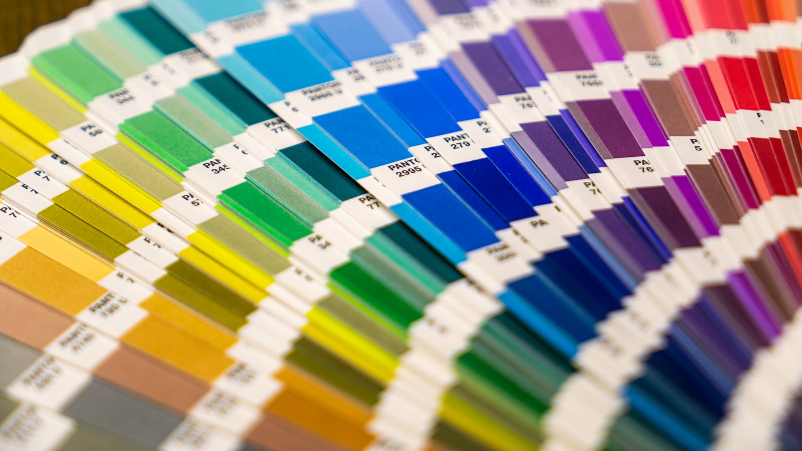
A brand colour palette is the defined, finite set of colours your business uses everywhere, each pinned to exact values so it never drifts. The difference between a palette and “the colours we like” is precision: every colour has a job, a proportion and a specified code for screen and for print. This guide walks through how we actually build one — its structure, how many colours is too many, how to keep contrast accessible, and how to define values so a colour looks the same on a phone, a poster and a printed box.
The structure of a brand colour palette
A useful brand colour palette is layered, not a flat row of swatches. Each layer has a role:
- Primary — the one colour most associated with the brand. It does the heavy lifting and shows up most often.
- Secondary — one or two supporting colours that add range and let you differentiate sections, products or sub-brands.
- Accent — a high-impact colour reserved for the things you want noticed: buttons, links, highlights, calls to action. Used sparingly, it stays powerful.
- Neutrals — your blacks, greys, off-whites and a paper-friendly background tone. These are the unsung workhorses; most of your body text and backgrounds live here.
A common mistake is having lots of bright colours and no proper neutrals. Without a strong dark for text and a soft light for backgrounds, the bright colours have nothing to sit against.
How many colours is too many?
If a designer can’t recite the palette from memory, it’s too big. As a practical rule, aim for one primary, one or two secondaries, one accent and a small neutral family. That’s enough to build a website, packaging and a full collateral suite without monotony.
The reason to stay tight is consistency. Every extra colour is another thing a junior designer, a printer or an external agency can get wrong. Range should come from tints and shades of your core colours rather than from adding new hues.
Deriving tints and shades
You expand a small palette by adjusting lightness, not by inventing new colours:
- Tints — lighter versions made by adding white (or raising value/lowering saturation). Useful for backgrounds, hover states and subtle fills.
- Shades — darker versions made by adding black. Useful for text on coloured panels, borders and depth.
Building a small ramp of, say, five steps from light to dark for each core colour gives you a flexible system that still reads as one family. This is what lets two or three colours feel like enough.
Ensuring accessible contrast
A palette has to be readable, not just attractive. Before locking anything, test every text-on-background pairing against the Web Content Accessibility Guidelines:
- 4.5:1 minimum for normal body text.
- 3:1 for large text and meaningful interface elements.
Run the combinations through a free contrast checker. Frequently your brand primary will pass as a background block but fail as body text — the fix is to use a darker shade from your ramp for type while keeping the brand colour for fills. Decide this at palette stage and you avoid a thousand ad-hoc decisions later.
Defining values precisely: HEX, RGB, CMYK, Pantone
This is where palettes live or die. The same colour is described differently depending on where it appears, and if you only specify one, it will shift everywhere else. Define all of them:
- HEX — a six-character code (e.g. #1A4D8F) used in web and digital design. The everyday currency of screen colour.
- RGB — red, green, blue values for screens. Screens emit light and mix colour additively, so RGB (and its HEX shorthand) is what governs anything on a display.
- CMYK — cyan, magenta, yellow, black for print. Ink on paper mixes subtractively, and the printable range is smaller than a screen’s, so a vivid RGB colour can look duller in CMYK. Specify the CMYK build so the printer isn’t guessing.
- Pantone (PMS) — pre-mixed spot-colour inks identified by number. When exact, repeatable colour matters — a logo across different print runs, a packaging line, signage — a Pantone reference is the safest anchor because it’s a physical standard, not a recipe each printer mixes differently.
The short version: RGB/HEX for screen, CMYK for print, Pantone when you need a colour to match exactly run after run. Document all four for each palette colour and you remove the single biggest cause of inconsistent brand colour.
Testing the palette in context
Colours behave differently depending on what surrounds them and what they’re printed on. A swatch on a white artboard tells you very little. Before signing off, mock the palette up in the places it actually has to work:
- UI — buttons, links, alerts, hover and disabled states, light and dark backgrounds.
- Packaging — on the actual substrate, since the same CMYK build looks different on matte board versus glossy stock.
- Signage — large format and outdoors, where Singapore’s strong daylight and glare change how a colour reads.
Testing across these surfaces is also a contrast check in disguise; a colour pairing that’s fine on screen can become unreadable on a backlit sign. See how this plays out across real projects in our work portfolio.
Documenting the palette in guidelines
A palette only stays consistent if it’s written down where people can find it. In your brand guidelines, for each colour include its name, role (primary/secondary/accent/neutral), all value definitions (HEX, RGB, CMYK, Pantone), the tint and shade ramp, and the do’s and don’ts — including which combinations are approved for text and which aren’t. Then put the swatch files somewhere shared, not on one designer’s laptop. Defining and documenting the palette this way is a standard part of our branding and design work.
Frequently asked questions
Why does my brand colour look different in print?
Screens use RGB and emit light; print uses CMYK ink on paper and can reproduce a smaller range of colours, so vivid screen colours often look duller in print. Specify a CMYK build — and a Pantone reference for anything that must match exactly — so the printer matches your intent instead of guessing.
How many colours should a brand colour palette have?
Aim for one primary, one or two secondaries, one accent and a small set of neutrals. Get range from tints and shades of those core colours rather than adding more hues. A tight palette is far easier to keep consistent across teams and vendors.
What contrast ratio do I need?
WCAG asks for at least 4.5:1 between body text and its background, and 3:1 for large text and key UI elements. Test every pairing with a contrast checker, and keep a darker shade of each brand colour for use as text.
Need a palette that holds up from screen to signage? Talk to us and we’ll build and document one properly.