
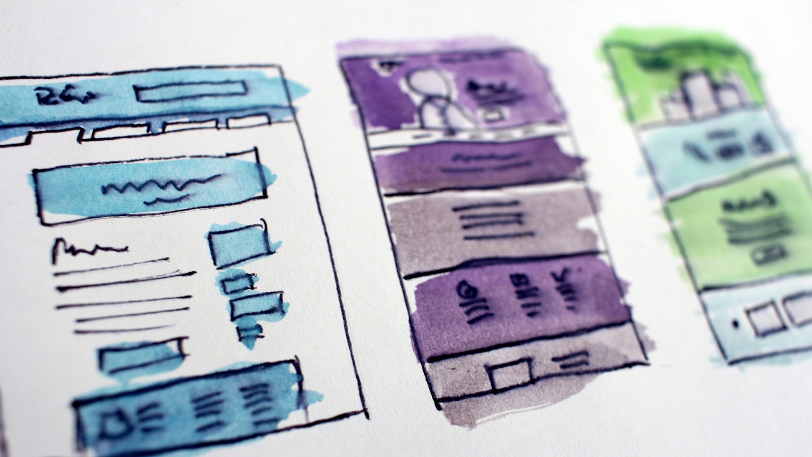
Good web design branding is not about making a website that looks nice in isolation. It’s about translating a brand identity — the logo, colours, type and tone you already own — into a working digital system that holds together across a homepage, a product page, a mobile menu and an email signature. When that translation is done well, your site feels like your brand. When it’s rushed, you get a beautiful logo bolted onto a generic template, and the gap shows.
This guide walks through how a Singapore studio actually approaches web design branding: the decisions that turn a static identity into a responsive, fast-loading, consistent experience.
What web design branding really means
A brand identity is usually defined in print-style assets — a logo lockup, a colour palette, a typeface, maybe some photography direction. A website is a different medium. It scales, it reflows, it loads progressively, and it has states a poster never does: hover, focus, error, loading, empty. Web design branding is the work of carrying your identity into all of those states without losing it.
That means answering practical questions. What does the brand colour look like as a button background versus body text? Does the headline typeface survive at 14px on a phone? What happens to the logo when the screen is only 360px wide? These are branding decisions, not just engineering ones, and they’re easiest to get right when the identity and the site are designed to talk to each other. If you’re still building the underlying identity, our branding and design work is where that foundation gets set.
Turning an identity into design tokens
The cleanest way to keep a brand consistent online is to break it into design tokens — small, named decisions that the whole site reuses. Instead of picking a colour by eye on every page, you define the brand palette once as tokens (primary, secondary, surface, text, accent) and the site references those names.
- Colour tokens with documented usage — which colour is for primary actions, which is for backgrounds, which is for warnings.
- Type scale tokens — a fixed set of sizes for H1 through body and captions, so headings stay rhythmic page to page.
- Spacing tokens — a consistent spacing unit so layouts breathe the same way everywhere.
Tokens are what stop a website from drifting six months after launch when a new page gets added by someone else. They’re the difference between a brand and a collection of pages.
Colour contrast and accessibility
A brand palette chosen for a logo doesn’t automatically work on screen. A pale brand yellow that sings on a poster can be unreadable as text on white. Web design branding has to respect WCAG contrast guidance: body text typically needs a contrast ratio of at least 4.5:1 against its background, and large text at least 3:1.
This often means defining a darker or lighter variant of a brand colour specifically for text and interface use, while the original stays for large graphic moments. It’s not diluting the brand — it’s making it legible for everyone, including the meaningful share of Singapore users browsing on phones in bright sunlight.
Mobile-first and responsive behaviour
Singapore is a mobile-heavy market, and most local sites see the majority of their traffic on phones. That makes mobile-first the sensible default: design the small screen first, then scale up, rather than squeezing a desktop layout down.
Responsive branding is about what survives the squeeze. The logo may need a compact mark for the mobile header. Multi-column layouts collapse to a single column, so the visual hierarchy has to be ordered, not just arranged. Generous desktop spacing has to tighten without feeling cramped. Deciding these things up front keeps the brand intact on the screen most people actually use.
Web fonts and performance
Type carries a lot of a brand’s personality, but custom web fonts have a cost. Each weight is a file the browser has to download, and while it loads the page can show a flash of unstyled text (FOUT) or invisible text. Web design branding has to balance fidelity against speed.
- Limit the number of font weights you load — two or three usually covers a whole site.
- Use modern formats (WOFF2) and self-host or use a reliable provider to control loading.
- Set a sensible font fallback so the page is readable while the brand font arrives.
Speed is itself a brand signal. A site that loads quickly feels more credible than one that hangs, no matter how polished the visuals are.
Components, motion and consistency
Modern sites are built from components — a button, a card, a navigation bar — reused across pages. Branding those components once, with their hover, focus and disabled states defined, is what makes a large site feel coherent. It also makes the eventual handoff to developers far cleaner, because the brand is documented as reusable parts rather than one-off page designs.
Motion is part of the identity too. Subtle microinteractions — a button that responds to a tap, a smooth menu transition — should match the brand’s character. A precise, corporate brand moves differently from a playful one. Keep motion purposeful; decoration for its own sake slows the page and dates quickly. You can see how this consistency plays out across real projects in our portfolio of work.
Frequently asked questions
Do I need a brand identity before designing a website?
Ideally, yes. A website is a translation of an identity, so having the colours, type and tone defined first makes web design branding far smoother. If you don’t have one yet, it’s worth building the identity and the site together rather than retrofitting a brand onto a finished template.
How do you keep a brand consistent as the site grows?
Design tokens and documented components. When colours, type sizes, spacing and reusable elements are defined centrally, new pages inherit the brand automatically instead of being designed from scratch — which is where consistency usually breaks down.
Will custom fonts slow my site down?
They can, if you load too many weights. The fix is to limit weights, use modern formats, self-host or use a fast provider, and set good fallbacks. Done properly, you keep the brand typeface without a noticeable hit to load speed.
Ready to bring your brand online properly? Tell us about your project and we’ll help translate your identity into a fast, consistent site.


