
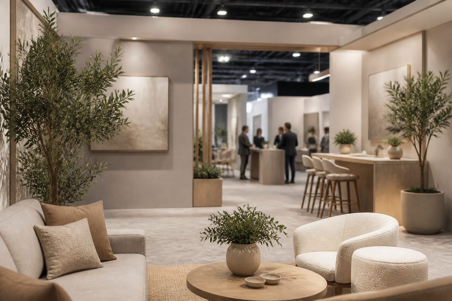
At a trade show, you have about three seconds to stop someone walking down a busy aisle. Exhibition booth design is the discipline of winning those seconds and then turning a glance into a conversation. It’s not graphic design on a wall — it’s spatial, three-dimensional thinking about how people move, where they look, and what makes them step in. Whether you’re exhibiting at Singapore Expo, Suntec, Marina Bay Sands or a smaller industry showcase, this guide covers how we design booths that pull traffic and generate leads rather than just looking pretty in photos.
Think in three dimensions, not two
The most common failure is designing a booth like an oversized poster — a flat back wall covered in text. People don’t read walls in a crowded hall. A good stand is an environment you design from above (the floor plan), from across the aisle (the sightlines), and from inside (the experience). You’re orchestrating height, depth, lighting and flow, not decorating a panel.
Start from the booth type and its open sides. A linear inline booth (open on one side), a corner booth (two sides), a peninsula (three sides) and an island (all four) each demand a different layout and a different approach to where the branding faces. The number of open sides changes everything about sightlines and traffic, so the design has to begin there.
The three-second attract test
From across the aisle, a visitor should instantly grasp two things: who you are and why you’re worth a stop. That means your brand name and a single, benefit-led message need to be visible above the crowd and from a distance — typically high up, large, and uncluttered. Eye-level and below gets blocked by bodies in a busy hall, so the identity has to live up high.
Resist cramming the walls with features and paragraphs. One dominant brand element, one clear value message, and strong visual branding that’s recognisable at ten metres will out-pull a wall of dense copy every time. If your brand identity is well-defined, the booth becomes a confident expression of it rather than a guessing game.
Design in zones: attract, engage, convert, store
A booth that works tends to be planned as functional zones rather than one undifferentiated space:
- Attract — the outward-facing branding and hero message that stops people: the tall sign, the bold graphic, the lighting that draws the eye.
- Engage — the demo station, product display, screen or interactive element where a visitor’s curiosity turns into a conversation.
- Convert — a comfortable spot to talk, capture a lead, or close — a meeting nook, a counter, somewhere staff and visitor can speak without shouting.
- Store — a lockable storeroom or hidden cupboard for stock, bags, brochures and coats. Skip this and clutter spills into the customer-facing space and kills the look.
Plan the traffic flow between these zones deliberately. You want a clear, inviting path in — an open, low threshold rather than a counter that walls people out — and a natural route that leads a visitor from the attract message toward the conversion point.
Large-format graphics that hold up at size
Exhibition graphics are printed huge — backwalls several metres wide, hanging banners, fabric tension panels. Two things matter. First, resolution at final size: a logo or image that looks fine on a slide will fall apart blown up to three metres, so artwork must be vector or genuinely high-resolution at the printed dimensions. Second, composition for distance: big, simple, high-contrast visuals read across a hall; fussy detail and small text disappear.
Mind the build, too. Graphics get split across panels with seams, and key elements shouldn’t land on a join or behind a structural upright. Modern systems use tension-fabric prints that are lightweight, seamless and reusable — often a smarter choice than rigid panels for stands you’ll run more than once.
Lighting, height rules and the hanging sign
Lighting is the most underrated tool in exhibition booth design. A hall is often flatly lit and visually noisy; targeted lighting on your brand wall, product or sign makes your space feel premium and pulls the eye toward it. Budget for it from the start rather than treating it as an afterthought.
Height is where you win or lose the aisle. A hanging sign or a tall tower lifts your brand above the crowd so people spot you from far down the row — but venues like Singapore Expo and the major convention centres set strict rules on maximum build height, hanging-sign clearances and rigging. Confirm the organiser’s and venue’s height and rigging regulations before you design, because a stunning concept that breaches the height limit is worthless.
Custom build vs modular reusable systems
If you exhibit regularly, decide early between a one-off custom build and a modular, reusable system. A bespoke build gives you total creative freedom and the most distinctive presence, but it’s the most expensive and is often dismantled and discarded after one show. A modular system — reconfigurable frames, swappable fabric graphics, packable lighting — costs more upfront than a throwaway stand but pays back across multiple events and adapts to different booth sizes.
For most Singapore SMEs doing a few shows a year, a well-designed modular system with refreshable graphics is the practical sweet spot. Factor in the unglamorous logistics too: storage between shows, transport, and build/teardown time and labour all affect the real cost. We design with those constraints in view so your stand is as easy to run as it is to look at. You can see how we translate a brand across formats in our portfolio.
Design for the actual goal: leads
A booth is a marketing investment, so design it around the outcome. Make lead capture effortless — a clear reason to scan or sign up, a simple mechanism, and staff positioned to start conversations rather than hide behind a counter. Build in a focal demo or interaction that gives people a reason to linger, because dwell time is what turns foot traffic into qualified conversations. The prettiest stand in the hall is a failure if nobody leaves their details.
Frequently asked questions
How early should we start exhibition booth design before a show?
Earlier than most people think — large-format printing, custom fabrication, lighting and venue approvals all take lead time, and organiser deadlines for rigging and build are firm. Starting well ahead of the event gives room to refine the concept and avoid rush costs.
What’s the most important part of a booth on a tight budget?
Height and a single strong message. A tall, well-lit brand element with one clear value statement will pull more traffic than an expensive but flat, text-heavy wall. Spend on visibility and lighting before anything decorative.
Should we reuse the same stand across multiple events?
If you exhibit more than once or twice a year, a modular system with swappable graphics usually works out cheaper and greener than a fresh custom build each time, while still letting you refresh the look per show.
Do I need to follow venue rules for booth height?
Yes. Singapore Expo, Suntec, MBS and other venues set maximum heights, hanging-sign and rigging rules, and these vary by hall and booth type. Always confirm the current regulations with the organiser before finalising any design.
Exhibiting soon? Tell us about your show and goals and we’ll design a booth that stops the aisle and fills your lead list.


