
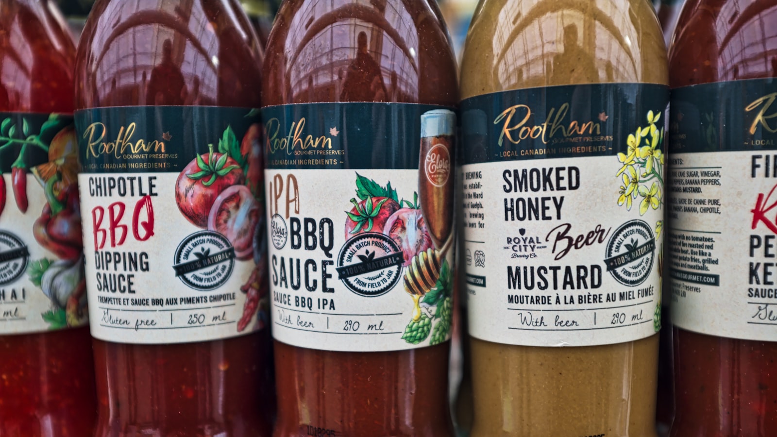
Label design is its own craft, separate from box and carton work. A label has to wrap a curved surface, survive a fridge or a wet hand, carry mandatory information legibly in a small space, and still look like your brand. The container and the application method shape the design as much as the graphics do. This guide covers what actually matters when you design a product label and hand it to a printer.
If you’ve read our packaging guide, treat this as the close-up companion: same production mindset, but focused on labels specifically.
Size and shape the label to the container
A label is designed for a specific container, not in the abstract. Before drawing anything, measure the bottle, jar or tub: its circumference, the height of the straight (labellable) area, and where curves or shoulders begin. Key decisions:
- Shape — rectangular, rounded-corner, oval, circular or a custom die-cut. Rounded corners resist peeling and look more finished; sharp corners lift over time, especially on curved surfaces.
- Wrap vs front/back — a single wrap-around label gives a seamless 360° canvas (mind where the seam overlaps); separate front and back labels are simpler to apply and let you split brand and legal content.
- Curved surfaces — on small-diameter bottles, keep the label width modest so it doesn’t wrinkle, and avoid critical detail right at the vertical edges where it curves away from view.
Choosing the label material
The material (or “facestock”) is the first durability decision, and it depends entirely on where the product lives.
- Paper — economical and easy to print, with a natural matte feel. Fine for dry goods and a craft look, but it tears, stains and isn’t water-resistant.
- BOPP (biaxially oriented polypropylene) — a synthetic film that’s waterproof, oil-resistant and tough. The default for drinks, cosmetics, bath products and anything that gets wet. Available in white, clear and metallised.
- Clear (no-label look) — clear BOPP that lets the container show through for a clean, premium feel. Needs careful printing (often a white underprint behind solid areas) so colours don’t go translucent.
Adhesive and application
The adhesive is invisible but make-or-break. Match it to the surface and conditions:
- Permanent adhesive for most retail products that should never peel.
- Freezer-grade / wet-strength adhesive if the product is chilled, frozen or condensation-prone — standard permanent glue can let go on a cold, damp bottle.
- Removable adhesive for promotions or returnable containers.
Application matters too. Tell your printer whether labels are applied by hand or by machine. Machine application needs labels supplied on a roll with a specified core size, wind direction and gap between labels; hand application can be more forgiving but is slower at volume.
Dieline, bleed and the roll
Like any print job, a label needs a proper dieline — the exact cut shape on its own layer. Build in 3mm bleed on any colour running to the edge so trimming or die-cutting variation never leaves a white halo, and keep important content a few millimetres inside the cut.
Labels print one of two ways:
- Roll (reel) — printed and die-cut on a continuous roll, ideal for machine application and longer runs. You’ll specify roll direction, core diameter and labels-per-roll.
- Sheet — printed on flat sheets, suited to short runs, hand application and odd shapes.
Legibility of mandatory info and barcodes
Small space, lots of required content — this is where label design is won or lost. Plan a clear zone for the legal and functional information from the outset:
- Barcode — keep it at a scannable size with clear quiet zones either side, printed in high contrast (dark bars on a light background — never light bars on dark). Don’t place it where the container curves sharply or where the label seam falls.
- Mandatory text — net weight or volume, ingredients, usage and warnings need a legible minimum type size and enough contrast. Don’t set legal copy in pale grey on a busy photo.
- Hierarchy — let the brand and product name dominate the front, and give the regulatory content its own calm, structured panel rather than scattering it.
Varnish and lamination for durability
A printed label without protection scuffs, smears and fades. A finish coat protects it and sets the look:
- Varnish — a thin coating, matte or gloss, for light protection and feel.
- Lamination — a film layer giving stronger scuff, water and UV resistance; the right call for fridge, freezer, bathroom or outdoor products.
For anything that gets wet or handled constantly — drinks, toiletries, sauces — a waterproof facestock plus lamination is the reliable combination. Test it: chill a printed sample, run it under water and rub it to see whether the print and adhesive hold.
Singapore F&B and retail considerations
Food and beverage labels in Singapore carry specific expectations — product identity, net quantity, ingredient information, and importer or distributor details, with extra requirements for certain categories and claims. Many local F&B brands also plan for halal certification and where its mark sits. Treat these as general design-planning inputs: leave room in your layout for the required information and certification marks, and confirm the current rules with the relevant authority or your client’s advisor before printing — never assume from a competitor’s pack.
Working with a label printer
Give a label printer a clean, complete brief:
- Container dimensions and the application method (hand or machine).
- The dieline on its own layer, with cut shape and bleed.
- Facestock, adhesive type and finish (varnish or lamination).
- Artwork in CMYK with any Pantone spot colours specified, plus a white-ink layer if you’re printing on clear film.
- Roll or sheet, with roll spec (core, wind, gap) if applicable, and quantity.
This production discipline is part of how we build coherent product identities in our branding and design work — see finished examples in our portfolio.
Frequently asked questions
Paper or BOPP for my label?
Use paper for dry goods or a deliberately natural, craft look, and BOPP film for anything that meets moisture, oil or cold — drinks, cosmetics, bath and chilled products. When in doubt for a wet environment, choose BOPP with lamination; it’s far more forgiving than paper.
Do I need a white layer for a clear label?
Usually, yes. Clear film lets the container show through, which can wash out colours and make text hard to read. A white underprint behind solid areas, logos or text restores opacity. Discuss this with your printer early — it changes how you build the file.
Why is my barcode not scanning?
Common causes are printing it too small, low contrast (light bars on dark, or coloured backgrounds), no quiet zone around it, or placing it on a sharp curve or over a label seam. Keep barcodes dark-on-light, adequately sized, with clear margins, on a flat part of the container.
Got a product that needs labels done properly? We design product labels from container to roll, brand and compliance included. Get in touch and we’ll help you get them right.


