
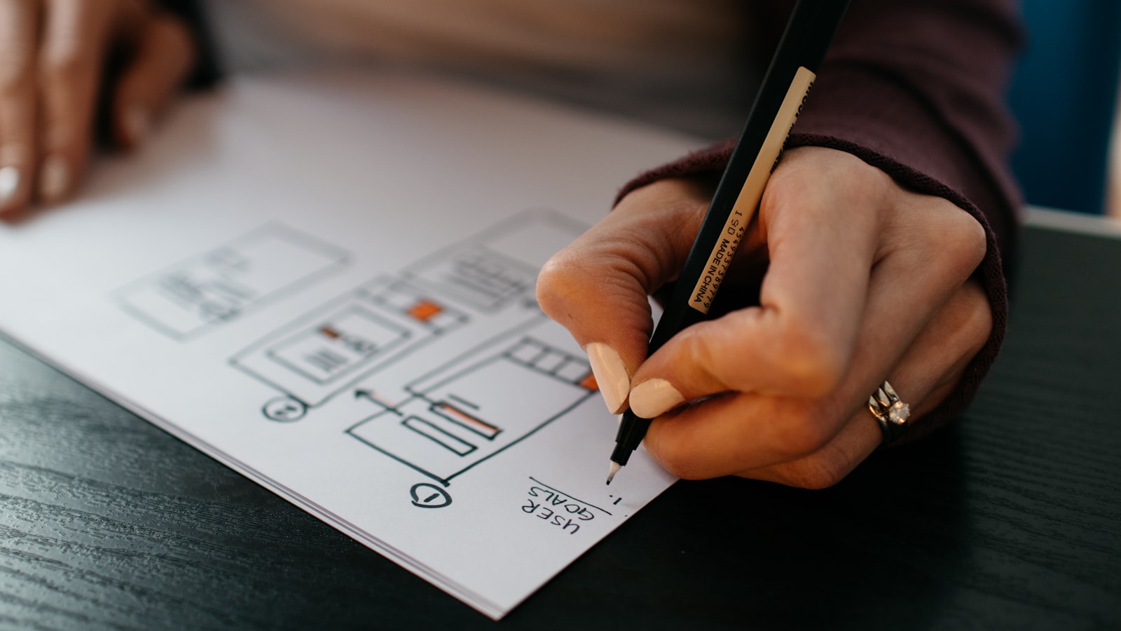
The logo design process is not someone in a dark room having a flash of inspiration. It’s a sequence of deliberate steps: understand the business, study the market, explore broadly, narrow ruthlessly, then build and test the survivors until they hold up everywhere from a favicon to a shopfront. This is how we actually run it at Advent, stage by stage, so you know what to expect and how to give feedback that improves the work rather than derails it.
1. Brief and discovery: getting the inputs right
Every good mark starts with a brief, and the brief starts with questions. Before anyone touches a pencil, we want to know what the business does, who it’s for, what it’s competing against, and what it needs the logo to do. A logo for a private clinic in Novena has a different job than one for a streetwear label.
We typically cover:
- Positioning — what makes this business different, in one honest sentence.
- Audience — who needs to recognise and trust it.
- Personality — three to five adjectives the brand should feel like (and a few it should never feel like).
- Practical constraints — where it’ll appear, any existing colours or names, languages, and whether it sits inside a wider identity system.
This discovery work is the foundation of our wider branding and design practice. Skip it and you’re decorating, not designing.
2. Research and competitor audit
Next we map the visual landscape. We pull the logos of direct competitors and adjacent brands, lay them side by side, and look for patterns: the same blue everyone uses, the same generic globe, the same overused typeface. The point isn’t to copy the category — it’s to find the gap. If every competitor is cold and corporate, warmth becomes a differentiator.
We also note technical realities here. A brand that lives mostly on mobile apps needs a mark that reads at 32 pixels. A brand that does a lot of embroidery or signage needs something that survives being stitched or cut from vinyl.
3. Moodboards and direction
Before generating logos, we agree on a direction using moodboards — collections of references, textures, type, and colour that establish the feel. This is a cheap, fast way to align before the expensive work begins. Approving a mood is far easier than reacting to ten finished logos with no shared starting point.
We usually present one to three distinct moods, each pointing somewhere different, so the client can react to territory rather than execution.
4. Sketching, then vectorising
Real exploration happens on paper or rough digital sketches. We push out dozens of thumbnails quickly because volume is how you get past the obvious first ideas. Only the strongest get vectorised — rebuilt cleanly in software so they’re mathematically precise and infinitely scalable.
Black and white first, always
We design in black and white before adding any colour. Colour is seductive and it hides weak ideas. If a mark works in plain black on white, it’ll work everywhere. If it only sings because of a gradient, the underlying form is probably weak. Colour is a decision we make later, deliberately, once the shape is right.
5. Presenting concepts
Here’s where expectations matter. A realistic logo design process presents two to three considered concepts, not twenty. Each concept is a complete, defensible idea shown in context — on a sign, a business card, an app icon — not floating on a white slide. We explain the thinking behind each one and tie it back to the brief, because a logo is an argument, not a decoration.
You can see how this plays out across real projects in our work portfolio.
6. Refinement rounds
The client picks a direction, and we refine. Two to three rounds of revisions is normal and healthy; ten is a warning sign that the brief was unclear or feedback is chasing personal taste. We tighten spacing, adjust weights, test colour options, and resolve the small decisions that separate amateur from professional work.
The single most useful thing a client can do is give feedback against the brief, not against taste. “I don’t love green” is a dead end. “This feels too playful for a law firm” is actionable — it points at the positioning we agreed on. Good feedback references the goals; weak feedback references the mood you happen to be in that afternoon.
7. Testing at scale
Before we finalise, we stress-test the mark across the full range of real-world sizes and contexts:
- Favicon and app icon — does it read at 16–32px?
- Social avatar — does it survive a circular crop?
- Business card and letterhead — clean at small print sizes.
- Signage and large format — holds up blown up to a metre wide.
- Single colour — works in pure black, pure white (reversed), and on a photo background.
A logo that only looks good at one size isn’t finished.
8. Finalising and delivery
The last stage is packaging. We deliver vector master files (AI, EPS, SVG, PDF) plus exported PNGs for screen, in full-colour, mono-black and reversed-white variants, properly organised and named. We include a mini guidelines document covering clear space, minimum size, colour values, and the do-nots — so the logo survives contact with the rest of the world after we hand it over.
Frequently asked questions
How many logo concepts should I expect?
Two to three strong, fully-reasoned concepts is the realistic standard from a studio. A flood of twenty options usually means quantity is standing in for quality and a clear brief.
How long does the logo design process take?
For a focused logo, plan on roughly three to six weeks, depending on research depth and how quickly feedback comes back. A full identity system takes longer. Rushing the discovery stage is where most of the pain comes from later.
Why do designers start in black and white?
Because colour can disguise a weak idea. If the form is strong in plain black, it’s strong everywhere. Colour is added as a deliberate decision once the shape is resolved, not used as a crutch.
Ready to start? Tell us about your project and we’ll walk you through the process, timeline and what a logo for your business should actually achieve.


