
A visual identity is the system of visual elements — logo, colour, typography, imagery, layout and graphic devices — that makes a brand recognisable on sight. The word “system” is the important part. Anyone can pick a nice logo; the skill is making a set of visual decisions that flex across a name card, a TikTok video, a delivery van and a shopfront while still reading as one brand. This guide explains how those systems are built and why the connective tissue matters more than any single element.
Visual identity vs brand identity
People use the terms loosely, so worth being precise. Brand identity is the whole expressed brand, including verbal elements like voice and messaging. Visual identity is specifically the visual layer of that. So your tone of voice is part of brand identity but not visual identity; your colour palette is part of both. When a designer talks about a “visual identity system,” they mean the coordinated set of visual assets and the rules binding them.
The building blocks of a visual identity
A robust visual identity is built from a handful of core elements, each designed to work with the others:
- Logo and marks — the primary logo, plus simplified versions (an icon, a monogram) for small spaces like app icons and favicons.
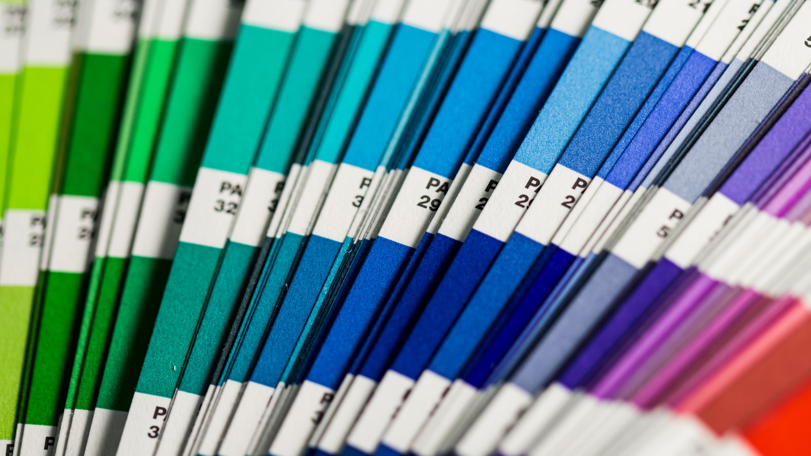
- Colour palette — a disciplined set of primary, secondary and accent colours, defined precisely so they reproduce the same on screen and in print.
- Typography — typefaces and a hierarchy that handle everything from a hero headline to legal fine print.
- Imagery style — the look of photography, illustration and iconography, including treatment, framing and subject matter.
- Graphic devices — supporting shapes, patterns, lines or motifs that add flavour and tie applications together.
- Layout and grid — the spatial logic that gives everything consistent structure and breathing room.
Why it has to be a system, not a collection
A logo, a colour and a font chosen separately rarely feel like one brand. A system designs them to relate — the colours share an undertone, the graphic device echoes the logo’s geometry, the photography style suits the personality. That coherence is what lets a customer recognise you from a cropped corner of an ad, before they read a word.
Systems also create flexibility. A well-built identity gives designers enough range — multiple colour combinations, layout options, a family of graphic elements — to keep things fresh across hundreds of touchpoints without inventing new rules each time. That balance of consistent-but-not-monotonous is the real craft.
Designing for Singapore’s touchpoints
A visual identity has to survive the specific places your customers meet you. For a Singapore business that often means small screens first — your identity has to read on a mobile feed, a Grab listing, a Shopee storefront and a QR-code standee, not just a desktop website. It means working bilingually if your audience does, where a typeface needs to sit comfortably beside Chinese characters. And it means physical contexts: shophouse signage, MRT-corridor posters, packaging on a shelf.
We test identities in these real contexts during design, because an identity that only looks good on a clean white artboard tends to fall apart the moment it hits the world.
How a visual identity gets built
The process moves from thinking to making:
- Brief from strategy — personality, positioning and audience set the creative direction.
- Concept and direction — explore a few distinct visual territories before committing to one.
- Core design — develop the logo, palette and type together as a connected system.
- Extension — build out imagery, devices, templates and applications.
- Documentation — capture the rules so the system stays intact over time.
This is the heart of our branding and design work, and the range of visual identity systems we have built across industries is visible in our portfolio.
Signs your visual identity needs work
- Your materials look like they come from several different companies.
- The logo works but everything around it is improvised case by case.
- The identity falls apart on mobile or at small sizes.
- Staff keep asking “what font/colour do we use?” because nothing is defined.
- The look no longer matches the quality or maturity of the business.
Balancing consistency and flexibility
The hardest judgement in any visual identity is how tight to make it. Too rigid, and every piece looks identical and the brand feels stiff and repetitive. Too loose, and consistency collapses and recognition is lost. The answer is to be strict about the few things that drive recognition — the logo, the core colours, the primary typeface — while giving designers room to play within a defined palette of layouts, secondary colours and graphic devices. A well-built system feels recognisably the same from one piece to the next, yet never boring. That deliberate balance is what separates an identity built by professionals from a one-off logo plus a colour someone liked.
Frequently asked questions
Is a visual identity just a logo and colours?
No. A logo and colours are part of it, but a full visual identity also includes typography, imagery style, graphic devices, layout rules and the system that makes them work together. The system is what creates recognition across many different touchpoints.
How is visual identity different from branding?
Visual identity is the visual layer — what people see. Branding is the broader, ongoing work of building the brand, including strategy, messaging and verbal identity as well as visuals. Visual identity is a crucial output of branding, not the whole of it.
How do I keep my visual identity consistent?
Document the system in brand guidelines, store master assets and templates where everyone can reach them, and give one person responsibility for sign-off. Consistency is mostly an operational habit, not a one-time design decision.
Want a visual identity that holds together everywhere? Get in touch and we’ll design the system.


