
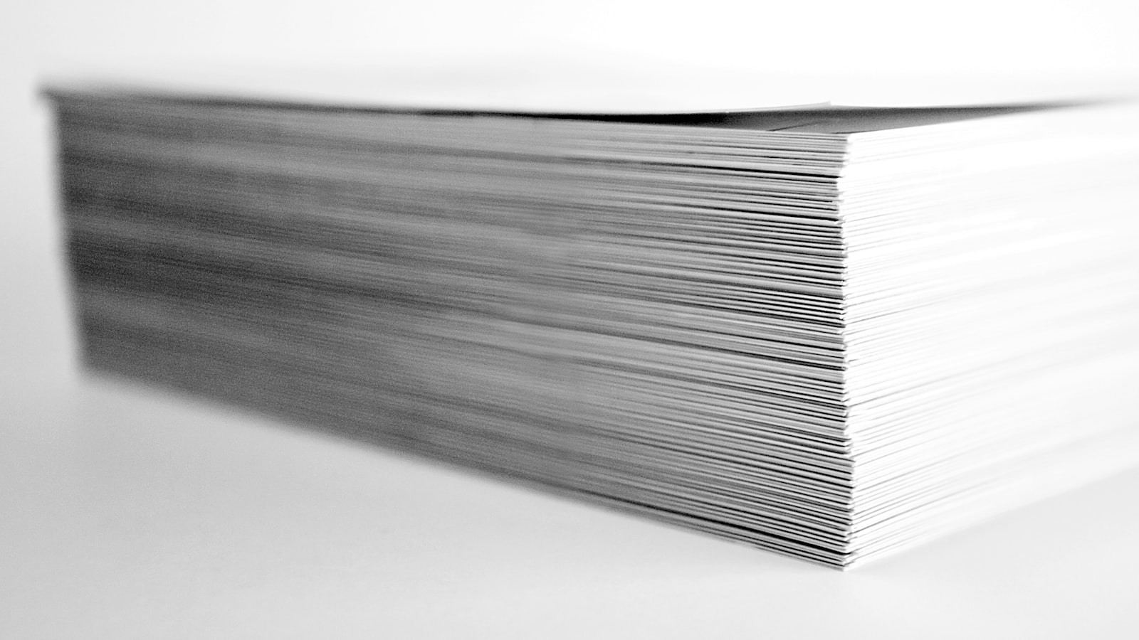
In Singapore business, the name card is still the handshake’s twin — exchanged in the first thirty seconds of a meeting, often with two hands, and quietly judged. Good name card design does a lot of work in a small space: it confirms who you are, signals the quality of your brand, and gives the other person a reason to remember you. This guide covers how we approach name card design as a Singapore studio — the standard sizes, the paper and finishes that make a card feel considered, and the print specs that keep it crisp.
The standard size (and when to break it)
The common name card size in Singapore is 90 × 54mm, which fits local card holders, wallets and scanners. The international 85 × 55mm is also widely used and is close enough that either works. We almost always recommend sticking to a standard size: it slots into existing holders, costs less to print, and avoids the small friction of a card that does not fit.
Square cards (e.g. 55 × 55mm) or slimline formats can make a deliberate statement for a design-led brand, but they trade convenience for distinctiveness — a fair trade only if standing out matters more than fitting in.
Paper stock and weight
Weight is the first thing the hand notices. A flimsy card undercuts an otherwise good design. Typical choices:
- 300–350gsm — the practical standard; substantial without being stiff.
- 400–600gsm — premium territory, achieved with a single heavy stock or by duplexing (gluing two sheets together), which also lets you show a coloured edge or core.
- Uncoated vs coated — uncoated (often a cotton or textured stock) feels warm and tactile and takes letterpress and embossing beautifully; coated stocks give sharper photographic colour and a smoother surface.
For professional services, consultancies and design-led brands, a heavier uncoated stock often reads as more premium than a glossy thin one.
Finishes that lift a card
This is where name cards earn their reputation. Used sparingly, a single special finish does more than several. Options we use:
- Hot foil stamping — metallic gold, silver, copper or coloured foil for logos and names; understated and premium.
- Embossing / debossing — raised or pressed type and marks you can feel; works best on uncoated and duplexed stocks.
- Spot UV — a clear gloss over a matt-laminated card to make a logo or pattern catch the light.
- Letterpress — a deep, tactile impression on thick cotton stock; characterful for studios and craft brands.
- Edge painting and rounded corners — small details that signal care.
The discipline is restraint. One strong finish on the right stock beats a card that tries every technique at once.
Designing the layout
A name card holds very little, so hierarchy is everything. Name and role first, then contact details, with the logo anchoring the brand. Keep a clear margin — type too close to the edge risks being clipped at the trim — and do not crowd both sides. Many of the best cards keep the back clean (a single logo, a colour, a pattern) and let the front carry the information.
Legibility wins over cleverness: small sizes and tight colours can look elegant on screen and disappear in print. We set contact details at a size that survives a 90mm card and check contrast on the actual stock.
Why the card should match the system
A name card rarely travels alone. It should sit naturally alongside the letterhead, the email signature, the website and the deck — same logo lockup, same colours, same type. When the card feels disconnected from the rest of the brand, it reads as an afterthought. We design name cards as part of a wider identity through our branding and design service, so the card, stationery and digital touchpoints feel like one brand. You can see brand systems we have built in our portfolio.
Print specs to get right
To keep a card crisp and avoid reprints, build in the basics: 3mm bleed on all edges, type kept at least 3–4mm inside the trim, CMYK colour (with Pantone specified for any brand colour that must match exactly), and artwork at 300dpi. For finishes like foil, spot UV or emboss, supply a separate spot layer that marks exactly where the effect goes. Always check a printed proof — fine type, thin lines and metallic foils all behave differently on the real stock than on screen.
Frequently asked questions
What size should a name card be in Singapore?
90 × 54mm is the common local size and fits most card holders and scanners; 85 × 55mm is the international equivalent and works too. Stick to a standard size unless standing out matters more than fitting holders.
Is a thicker card always better?
Heavier stock (350gsm and up) feels more premium, but the combination of stock and finish matters more than weight alone. A well-chosen 350gsm uncoated card with a clean letterpress logo often beats a thicker, glossier one. Match the feel to your brand.
How many cards should we print at once?
Name cards are cheaper per unit at higher volumes, but details change — people leave, titles shift, numbers update. For larger teams, print conservatively per person and reprint as needed rather than over-ordering cards that go stale. Keep the design template ready so reprints are quick.
Refreshing your name cards or whole identity? Tell us about your brand and we will design cards that match your system and feel right in the hand.


