
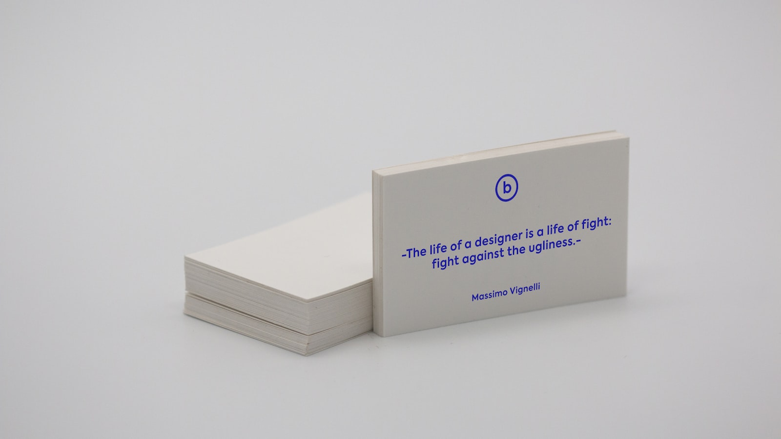
Print finishing is everything that happens to a printed piece after the ink goes down — the foil, the soft-touch laminate, the raised emboss, the spot of gloss, the unusual cut. It’s the difference between a flyer that feels disposable and a brand piece that feels considered the moment someone picks it up. Finishing is also where print budgets quietly inflate, so it pays to know what each technique does, what it costs in effort, and how to set up artwork for it.
This is a practitioner’s tour of the finishes worth knowing, and how to brief them.
Why print finishing matters more than people think
Most of a brand’s impressions are visual, but print is one of the few channels that’s also tactile. Weight, texture and finish register before anyone reads a word — a heavy, soft-touch card with a foil logo signals premium instantly; a thin, flat one signals the opposite. Print finishing is how you make print feel like the brand, which is why it belongs in the design brief, not as a last-minute add-on.
The catch: most finishes are applied as separate passes after printing, each adding cost and lead time. The skill is choosing one or two that genuinely earn their place rather than piling on everything at once.
Coatings and laminates
The most common — and often cheapest — way to change a piece’s feel:
- Gloss lamination — shiny, vivid, makes colours pop and resists scuffs; common on covers and packaging.
- Matte lamination — flat, sophisticated, reduces glare; a default for premium business cards and brochures.
- Soft-touch (velvet) lamination — a tactile, almost suede feel that signals quality the instant it’s held; very popular for premium cards and packaging.
- Spot UV — a glossy varnish applied to selected areas only (a logo, a pattern), often over matte lamination for striking contrast between flat and shiny.
Foil, embossing and debossing
These add dimension and metallic shine — the cues people read as “premium”:
- Foil stamping (hot foil) — a metallic or coloured foil pressed onto the stock with a heated die. Gold, silver, copper, holographic and matte foils all exist. It’s not printed colour — it has a genuine metallic sheen ink can’t fake.
- Embossing — pressing the stock from behind to raise a design above the surface; can be combined with foil (foil emboss) for raised metallic detail.
- Debossing — the reverse: pressing the design into the surface for a recessed, tactile impression. Works beautifully on thick, uncoated stock.
- Blind versions — embossing or debossing with no ink or foil, relying purely on the play of light and shadow on the relief. Subtle and elegant.
Each needs a custom die, so there’s a tooling cost and a lead time — worth it for a brand piece, overkill for a short-lived flyer.
Cutting and shaping
Going beyond the rectangle changes how a piece is experienced:
- Die-cutting — cutting the piece to a custom shape or cutting out windows and apertures, used for packaging, unusual card shapes and pop-ups.
- Kiss-cutting — cutting through the top layer only, the technique behind stickers and labels that peel off a backing.
- Perforation, scoring and creasing — controlled lines for tear-off sections and clean folds; heavier stock must be scored before folding or it cracks.
- Rounded corners — a small, cheap detail that subtly softens a card and reads as considered.
Edge and specialty finishes
The details that make people turn a card over twice:
- Edge painting / colour edges — applying colour to the cut edges of thick stock; striking on heavy cards.
- Duplexing / triplexing — bonding two or three sheets into one extra-thick card, sometimes with a contrasting colour core revealed at the edge.
- Letterpress — pressing inked type into soft, thick stock for a deep, tactile impression with real craft heritage.
- Specialty inks — metallic, fluorescent, glow or even scratch-and-sniff for the right job.
Choosing finishes that genuinely reinforce the brand — rather than chasing every shiny option — is part of the branding and design craft, and you can see finished, tactile pieces across our portfolio.
How to set up files for finishing
Finishing fails when the printer can’t tell where it goes. The rule is simple: each finish needs its own layer or spot colour, defined as artwork the press can read.
- Create a separate spot-colour layer for each finish (one for foil, one for spot UV, one for emboss) and name it clearly — e.g. “FOIL,” “SPOT UV,” “EMBOSS.”
- Set those spot colours to overprint so they sit over the artwork rather than knocking it out.
- Keep finish areas a sensible size — very fine foil lines or tiny embossed text can fill in or break. Ask the printer for minimum sizes.
- Choose thick, uncoated or soft-touch stock where the finish needs it — emboss, deboss and letterpress need stock with enough body to hold the impression.
- Always request a sample or proof of the finish on the actual stock before the full run; finishes are hard to judge on screen.
Frequently asked questions
What’s the difference between foil stamping and metallic ink?
Foil stamping presses a real metallic foil onto the stock with a heated die, giving a genuine reflective shine that ink can’t match. Metallic ink is a printed ink with metallic particles — cheaper and able to cover larger or more detailed areas, but with a duller, less mirror-like finish. For a premium logo, foil; for a large metallic area on a budget, metallic ink.
What’s the difference between embossing and debossing?
Embossing raises the design above the surface of the stock by pressing from behind; debossing presses the design into the surface for a recessed impression. Both can be done “blind” (no ink or foil) or combined with foil. Embossing draws the eye outward; debossing reads as subtle and tactile, and works especially well on thick uncoated stock.
Does print finishing add a lot to the cost?
They can. Most finishes are separate production passes, and foil, emboss and die-cut each need a custom die with its own tooling cost and lead time, so a heavily finished piece costs noticeably more than a plain print. The value comes from choosing one or two finishes that genuinely reinforce the brand rather than applying everything at once.
Want print that feels like your brand the moment it’s held? We design with finishing in mind and set up files so foil, emboss and spot UV land cleanly. Talk to us about your project.


