
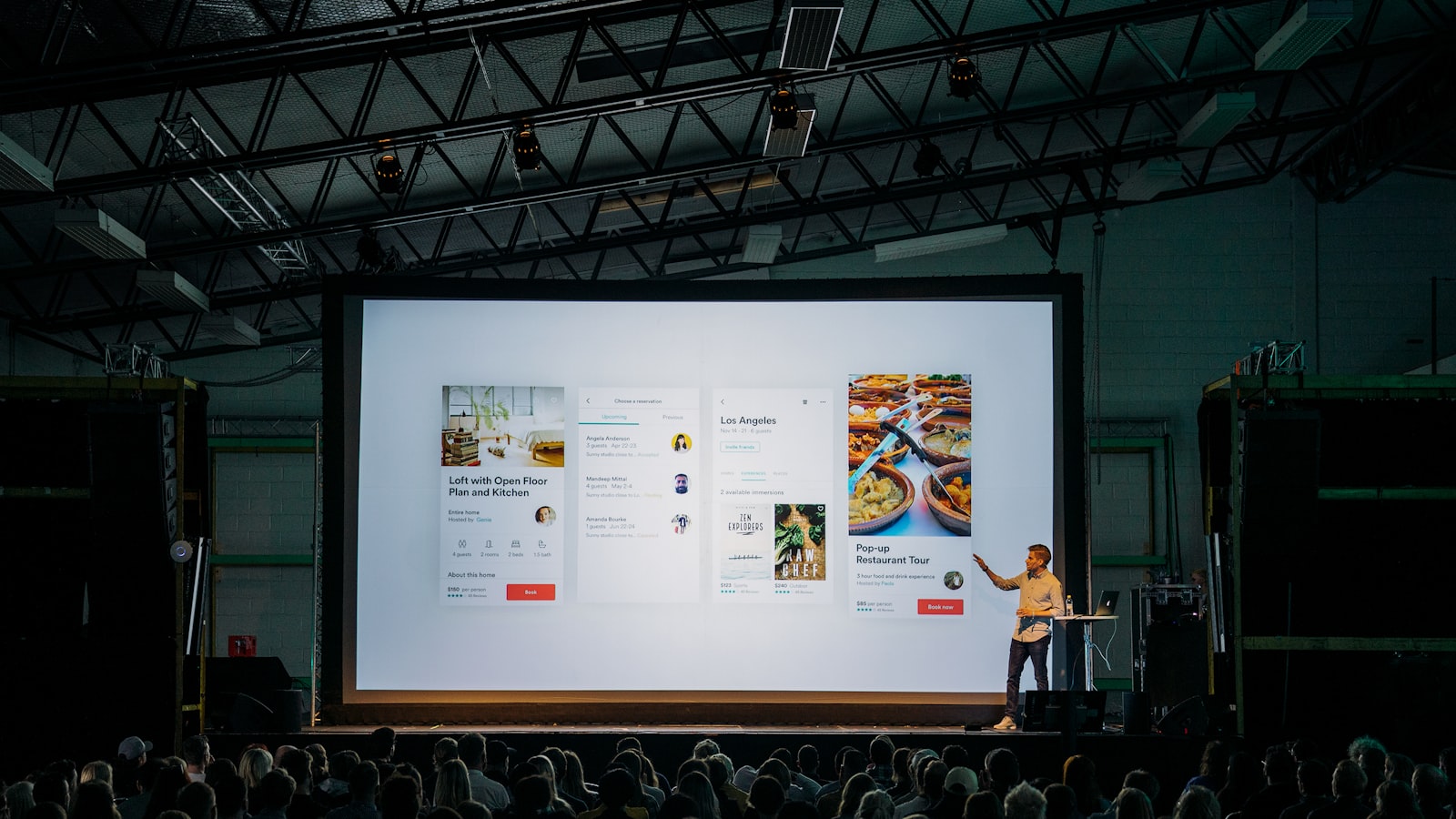
Good presentation design is not about making slides pretty. It is about helping one person stand in front of a room — or a single investor on a video call — and be believed. The deck is a support act for the speaker, not a teleprompter. In Singapore’s startup and SME world, where founders pitch at demo days, sales teams present to procurement, and agencies fight for accounts, a clear deck is often the difference between “let’s talk again” and silence. This guide covers how we approach presentation design as both a story and a system.
Start with the narrative, not the slides
Before anyone opens Keynote or PowerPoint, the argument has to make sense as spoken words. The most reliable structure for a pitch deck is problem → solution → proof → ask. You set up a tension the audience recognises, show how you resolve it, prove you can deliver, then state clearly what you want — funding, a contract, a yes.
Sales decks differ from investor decks. An investor wants the market size, the wedge, the team and the traction. A sales prospect wants to know you understand their problem and that buying you is low-risk. Same craft, different emphasis. We map the narrative on paper or a whiteboard first, one box per slide, so the flow is right before a single pixel is designed.
One idea per slide
The most common mistake is treating a slide like a document. If a slide carries three ideas, the audience reads instead of listening, and the speaker becomes redundant. The discipline of presentation design is ruthless reduction: one idea, one headline, one supporting visual per slide. If you have three points, that is three slides — slides are free.
Write the headline as a full sentence stating the takeaway (“Procurement cycles cost SMEs three weeks”) rather than a label (“Procurement”). The audience should grasp the point from the headline alone, with the visual and your voice adding colour.
Build a slide system, not one-off slides
Consistency is what makes a deck feel credible. We build a master template — defined title slide, section divider, content layouts, a data slide, a quote slide and a closing slide — using slide masters and layouts so spacing, type sizes and colours repeat automatically. This is where presentation design overlaps with broader branding and design: the deck should look like it belongs to the same brand as the website and the business cards.
- Type scale: typically two or three sizes only — headline, body, caption. Resist the urge to shrink text to fit; if it doesn’t fit, cut it.
- Grid: a simple margin and column grid keeps elements aligned across every slide.
- Colour: a restrained palette with one accent for emphasis. Too many colours read as noise.
Design for the room you’re presenting in
Where the deck will be shown changes the design. A deck projected in a bright Suntec meeting room needs higher contrast and larger type than one viewed on a laptop. Thin light-grey text that looks elegant on a Retina screen disappears on a budget projector. We design for the worst likely screen, not the best.
Default to 16:9 — it matches modern screens and video calls. Keep important content away from the bottom edge, which is often hidden behind heads or cut off by room screens. And remember many decks are now presented over Zoom or Google Meet, where compression softens fine detail, so avoid hairline rules and tiny labels.
Presenter deck vs leave-behind deck
A deck built to be spoken to and a deck emailed afterwards are two different documents pretending to be one. The presenter version can be visual and sparse because you fill the gaps with your voice. The leave-behind has to stand alone, so it needs more written context — often in an appendix or a denser “send” version. Trying to make one deck do both jobs usually produces something too text-heavy to present and too thin to read. We often deliver both from the same master.
Data visuals that clarify, not decorate
Numbers earn trust, but only if they’re legible. On a slide, a chart should make one point — pick the chart that shows it fastest. Strip gridlines, drop shadows and 3D effects; they add nothing. Label the bars directly instead of forcing the eye to a legend. Highlight the single data point that matters in your accent colour and mute the rest. If a table has twenty rows, it belongs in the appendix, not on screen.
Restraint with builds and animation
Animation should serve comprehension — revealing a process step by step, or building a chart so the audience follows your logic. Spinning transitions and bouncing text undermine credibility. We use simple cuts or gentle fades, and we keep builds purposeful. The test: would this movement help someone understand, or is it there to look clever? If the latter, cut it.
Frequently asked questions
How many slides should a pitch deck have?
For an investor pitch, around ten to fifteen slides is typical — enough to tell the story without losing the room. Sales decks vary more, but the discipline is the same: if a slide doesn’t move the argument forward, it goes. Length is a symptom; clarity is the goal.
Should I use PowerPoint, Keynote or Google Slides?
Whichever your audience and team can open reliably. We design master templates that hold their formatting across the tool you’ll actually present and share in. Google Slides is convenient for collaboration; Keynote and PowerPoint give finer typographic control. The platform matters less than the system behind it.
Can you make our deck match our brand?
Yes — a deck should be a brand touchpoint, not an afterthought. We align type, colour and layout with your identity so the presentation feels of a piece with everything else. You can see how we apply systems across formats in our work portfolio.
Got a pitch coming up? Tell us about your deck and we’ll help you make the argument land.


