
Sustainability report design has a difficult job: it must take dense, technical ESG data and disclosures and turn them into a document that is credible, readable and on-brand — without ever tipping into the glossy over-styling that invites accusations of greenwashing. As reporting expectations rise for listed companies and beyond, the report has become a serious governance document and a public statement of commitment at the same time. This guide explains how to design one that holds up to scrutiny.
What a sustainability report is for
A sustainability report communicates a company’s environmental, social and governance performance to stakeholders — investors, regulators, customers, employees and the public. For listed companies in Singapore it increasingly carries formal disclosure obligations, and even for those without a mandate it has become an expected signal of seriousness.
That dual role — compliance document and credibility statement — shapes the design. It has to be rigorous and trustworthy enough for analysts and regulators, and clear and engaging enough for a broader audience. Design that prioritises one at the expense of the other fails the report’s purpose.
Structure: make the data findable
Sustainability reports are long and data-heavy, so structure is the first design problem. A clear architecture lets different readers find what they need: a leadership statement that sets the tone, a materiality section that explains what the company has chosen to focus on and why, performance sections organised around the company’s chosen framework, and the detailed data, targets and indices that specialist readers require.
Good navigation — clear contents, consistent section design, signposting and a well-structured data index — is what turns an intimidating document into a usable one. The reader should always know where they are and where to find what matters to them.
Designing data so it tells the truth
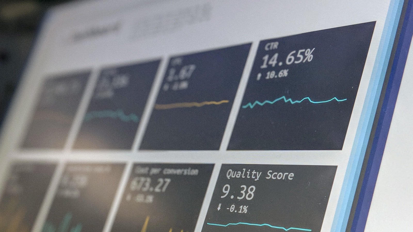
The heart of a sustainability report is data, and how it is visualised carries real ethical weight. Charts and graphics must represent the numbers honestly — proper scales, no truncated axes that exaggerate progress, no selective framing that flatters performance. Sustainability data visualisation is one of the few areas where misleading design is not just bad practice but a credibility and even compliance risk.
The goal is clarity in service of honesty: turning complex metrics into graphics that a non-specialist can understand while a specialist can trust. That means clear labelling, consistent units, context for the numbers, and visualisations that reveal the real story rather than dress it up. We bring this rigour to data-led documents as part of our branding and design work.
Frameworks and credibility
Credible sustainability reports are typically built around recognised reporting frameworks and standards, which give structure and comparability to the disclosures. While the choice of framework is the company’s decision, the design needs to support it — accommodating standardised disclosures, indices and indicators in a way that is both compliant and readable. A report that follows a recognised framework and presents its disclosures clearly reads as far more credible than a free-form document of selected highlights.
Design also signals seriousness through restraint. A report that looks like a marketing brochure undermines its own credibility; one that balances clarity and rigour with appropriate brand expression reads as a genuine account of performance.
Avoiding the greenwashing trap
Sustainability report design walks a fine line. Over-styling — lush nature photography, triumphant language, cherry-picked highlights, design that buries weak numbers — reads as greenwashing and is increasingly called out by investors, regulators and the public. The credibility of the report depends on balance and honesty.
The defences are concrete: present good and bad results with the same clarity, contextualise progress against targets honestly, let the data speak rather than smothering it in imagery, and keep the tone measured rather than self-congratulatory. A report that is candid about challenges is far more believable than one that implies everything is perfect.
Balancing brand and substance
A sustainability report is still a brand document, and it should look like it belongs to the company. The skill is expressing the brand without compromising the report’s seriousness — using the brand’s typography, colour and visual language in a restrained, document-appropriate way. The brand should reinforce credibility, not undercut it with marketing gloss. Striking that balance, across a long and complex document, is exactly the kind of work you can see in our portfolio.
Frequently asked questions
How is a sustainability report different from a marketing brochure?
A sustainability report is a credibility and often compliance document aimed at investors, regulators and the public, requiring rigorous, honest disclosure. A brochure sells. Designing a report to look like a brochure — glossy imagery, triumphant language, selective highlights — undermines its credibility and risks accusations of greenwashing.
How do we present data honestly in a sustainability report?
Use proper scales and full axes, label clearly and consistently, give context for the numbers, and show weak results with the same clarity as strong ones. Honest data visualisation is essential — misleading charts in a sustainability report are a real credibility and compliance risk, not just a design flaw.
Does a sustainability report need to follow a framework?
Recognised reporting frameworks give the report structure, comparability and credibility, and listed companies in Singapore increasingly face formal disclosure expectations. The framework choice is the company’s, but the design should support standardised disclosures and indices clearly so the report is both compliant and readable.
Producing a sustainability report? Tell us about your project and we will help you design one that is credible, readable and honest.


