
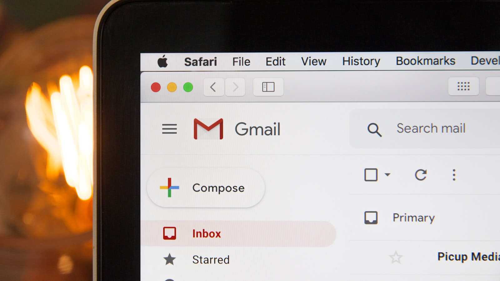
Email is the one design medium where it’s still 2005 under the hood. Good email design isn’t about pushing creative boundaries — it’s about making a branded message render correctly across dozens of inboxes that each interpret your code differently. A layout that looks perfect in your design tool can fall apart in Outlook, collapse on a phone, or vanish entirely when images are switched off. Designing email well means designing for those constraints from the start.
This guide covers the technical realities of email design and how to keep your brand intact within them, including the consent rules that apply when you send marketing email in Singapore.
Why email design has its own rules
Web browsers have largely converged on modern standards. Email clients have not. Outlook on Windows still renders with a layout engine that ignores much of what works on the web, while Gmail strips out styles it doesn’t like. The safe, reliable foundation for HTML email is still table-based layouts with inline CSS, because that’s what every client understands.
This is why you can’t simply export a web design as an email. Email design is a separate craft with its own toolkit: fixed-width tables, inlined styles, bulletproof buttons, and a healthy distrust of anything clever. The brand has to be expressed within those limits.
Layout: 600px and a single mobile column
The conventional safe width for an email is around 600px. Wider than that and it gets clipped in narrower preview panes. Within that width, design for a structure that collapses cleanly to a single column on mobile, because a large share of Singapore recipients open email on their phones first.
- Keep the core layout to one main column where you can — multi-column sections are fragile and reflow awkwardly on small screens.
- Make tap targets generous; a button squeezed next to another is easy to mis-tap on a phone.
- Front-load the message so the point survives in the preview text and the first scroll.
Typography and the web font problem
You can’t rely on custom web fonts in email. Many clients — Outlook chief among them — will ignore them and fall back to a default. So email design uses web-safe fonts (or a sensible system stack) for body copy, and reserves the brand typeface for places where it can live as an image, like a header graphic, used sparingly.
Build a clear hierarchy with size and weight so the email is skimmable: a strong headline, scannable subheads, short paragraphs, and one obvious next step. People read email fast — design for the skim, not the deep read.
Designing for images off and dark mode
Many inboxes block images by default until the reader chooses to load them, and some people simply never do. If your entire email is one big image, those people see a blank rectangle. Two habits protect you:
- Live text over images for anything important — headlines, offers, the CTA — so the message survives even with images off.
- Meaningful alt text on every image, so a blocked image still communicates something.
Dark mode adds another layer. Some clients invert or adjust your colours automatically, which can turn a dark logo invisible on a now-dark background. Test how your brand colours behave in dark mode and choose logo treatments and backgrounds that hold up either way. This kind of robustness is part of why a documented branding and design system pays off — you already know which logo variant works on which background.
Bulletproof buttons and the deliverability trade-off
A call-to-action button built as an image breaks when images are off. A “bulletproof button” is built with HTML and inline CSS so it renders as a real, clickable, styled button everywhere — with a coded fallback for stubborn clients. It’s a small detail that protects your most important click.
There’s also a deliverability trade-off to respect. Emails that are mostly heavy images with little real text are more likely to be flagged as spam and are slower to load. A healthy balance of live text and lighter, optimised images helps your email both arrive and render well.
Campaign EDMs vs transactional email
Not all email is the same. A campaign EDM (an electronic direct mailer — a newsletter or promotion) is designed to be noticed: a strong hero, a clear offer, brand personality. A transactional email — an order confirmation, a receipt, a password reset — is designed to be useful and instantly clear, with branding kept light and the key information unmissable.
Reusing a well-built template system for each type keeps your brand consistent across both while letting each do its job. You can see how that consistency carries across other branded touchpoints in our portfolio of work.
Consent and PDPA in Singapore
In Singapore, marketing email falls under the Personal Data Protection Act. In practice that means you should have consent to send marketing messages, make it clear who the email is from, and include a working way to unsubscribe. Build the unsubscribe link into your template so it’s never an afterthought — it’s both a legal expectation and a trust signal. Design and compliance aren’t in conflict here; a clean, honest footer is simply good email design.
Frequently asked questions
Why can’t I just use my website design for emails?
Email clients render code very differently from browsers — many still need table-based layouts and inline CSS, and most ignore custom web fonts. A web design exported as email will usually break in Outlook or on mobile. Email needs its own build.
Why do my emails look broken in Outlook?
Outlook on Windows uses an older rendering engine that ignores a lot of modern CSS. The fix is to design within email-safe techniques — tables, inline styles, bulletproof buttons — and test in Outlook specifically rather than assuming what works elsewhere will work there.
Should every email be heavily branded?
No. Campaign EDMs can lean into brand personality, but transactional emails like receipts should stay clear and functional with lighter branding. Match the level of design to the email’s job.
Need branded emails that render everywhere? Tell us about your project and we’ll design templates built for real inboxes.


