Two photographers can shoot the same product in the same light and get completely different results — because one styled the scene and the other just put the product down. Photo styling is the craft of arranging everything around the subject: the surface, the background, the props, the angle of every element. Done well it makes a product look desirable and tells a story in a single frame; done badly it clutters, distracts or dates the image. This guide covers the practical decisions that separate the two.
Styling starts with intent, not props
Before reaching for a single prop, decide what the image is meant to do. Good photo styling serves the product and the message — it isn’t decoration for its own sake.
- What’s the hero? The product is always the star; everything else supports it.
- What feeling are you after? Premium and minimal, warm and homely, fresh and energetic — the styling has to match the brand.
- Where will it run? A clean e-commerce shot and a rich lifestyle scene call for opposite amounts of styling.
Start from intent and every later choice gets easier. Start from “what props do we have?” and you end up with a busy frame that fights the product.
Surfaces and backgrounds: the foundation
The surface a product sits on and the backdrop behind it set the entire tone before you add anything else. They’re the most underrated styling decision.
- Neutral and seamless — white, grey or soft tones keep all attention on the product; the default for clean catalogue work.
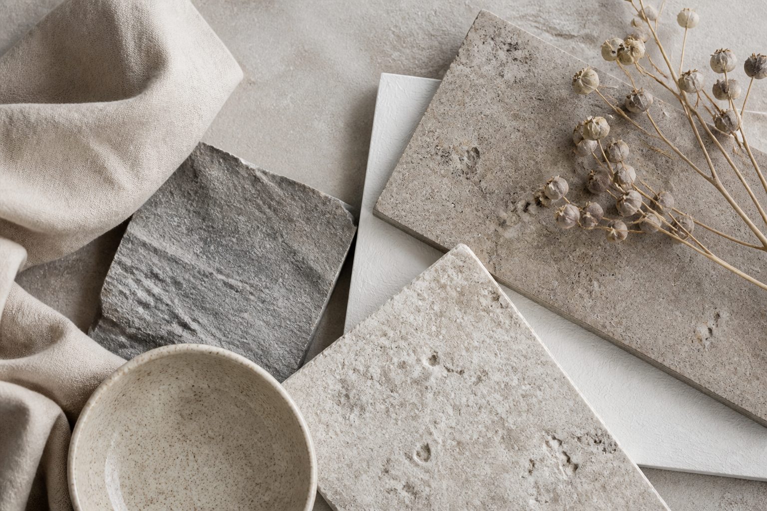
- Textured naturals — wood, marble, linen, stone, concrete — add warmth and a tactile, premium feel for lifestyle imagery.
- Branded colour — a backdrop in your palette makes product shots pop in a feed and reinforces identity.
Match the surface to the product: a rough rustic board suits artisan food but undercuts a sleek tech gadget, which sits better on clean stone or a solid colour. The surface should feel like it belongs to the same world as the product.
Choosing props that help, not hijack
Props add context and story — but the most common styling mistake is too many of them. The principle: every prop must earn its place.
- Support, don’t compete. Props should be quieter than the product — softer, more out of focus, smaller, or off to the side.
- Stay on-story. Use items that genuinely relate — coffee beans by a coffee product, ingredients around a dish, a relevant lifestyle object beside a gadget.
- Mind the brand. Props imply a world; make sure it’s yours. Cheap-looking props cheapen the product by association.
- Less is usually more. When in doubt, remove a prop. Negative space reads as confident and premium.
A good test: cover each prop in turn and ask whether the image is worse without it. If not, it goes.
Building the scene: layers and depth
A flat arrangement looks lifeless; a styled scene has structure. Build it in layers:
- Foreground — a small element near the lens (often softly blurred) adds depth and draws the eye in.
- The hero — the product, placed using composition principles, sharp and well-lit.
- Background — supporting context, kept subordinate, often softened so it doesn’t compete.
Vary heights and shapes so the eye has a path to travel — a tall element, a low one, a diagonal line of objects. This layering is what makes a lifestyle shot feel like a real, considered moment rather than items dropped on a table.
Food and flat-lay styling specifics
Two of the most styling-dependent genres deserve a note:
- Food lives or dies on freshness and “just-made” cues — steam, a drizzle, crumbs, a bite taken, garnish placed deliberately. It’s fiddly, fast work; food styling is often a specialism for good reason because food wilts, melts and dulls under lights within minutes.
- Flat-lays (shot straight down) are all about arrangement on a flat plane — balance, spacing, alignment and a consistent margin. Use a grid in your head, leave even breathing room, and resist overcrowding.
Both reward planning the arrangement before the food or products are even placed. This kind of considered styling is part of how our photography and content team approaches shoots, and you can see the range across our portfolio.
Avoiding the dated, cluttered look
Styling trends move, and certain looks date a brand fast. To keep imagery current:
- Resist over-propping — the busy, every-corner-filled flat-lay of a few years ago now reads as dated.
- Keep colours coherent with your brand rather than chasing every seasonal palette.
- Lean toward cleaner, more considered arrangements with intentional space.
- Make sure props don’t visibly age the shot (obvious old tech, seasonal items left in evergreen content).
Frequently asked questions
What is photo styling?
It’s the craft of arranging everything around the product — surface, background, props, composition — to make it look desirable and tell a story in one frame. Good styling supports the product and the brand message; bad styling clutters or distracts from it.
How many props should I use in a product photo?
As few as tell the story. Every prop should earn its place by adding relevant context without competing with the product. When in doubt, remove one — negative space reads as confident and premium, while over-propping looks busy and dated.
Do I need a professional stylist?
For simple clean catalogue shots, often not. For rich lifestyle scenes, food, or campaign hero images where the scene carries the message, professional styling makes a clear difference — especially for food, which wilts under lights and needs fast, expert handling.
Want product images styled to sell? Tell us what you’re shooting and we’ll plan the surfaces, props and scenes around your brand.